
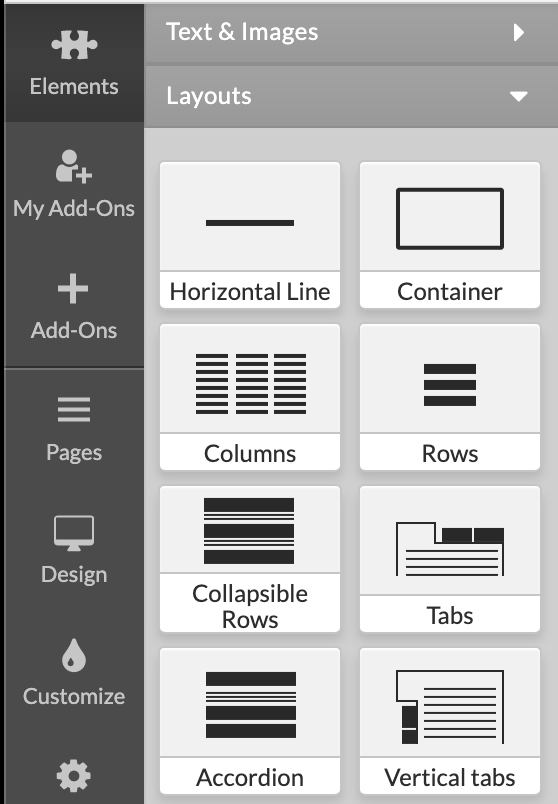
Sections are a great way to add structure and organization to your pages. Use Columns or Rows to create several separate content areas that will be displayed simultaneously.
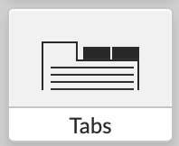
Tabs, Collapsible Rows and Accordions will accommodate a large quantity of content in limited space, or use them to conceal information that belongs on the page, but doesn't need to be compared or viewed simultaneously with other content.
You can Add Section Groups anywhere inside the main content area of your site.
Section Groups
To Add a Section Group, select Elements from the Left Menu, click on Layouts and drag the desired Section Group. Drop the element to the Blue rectangles which will appear to indicate the locations where a Section Group can be placed.
After the Section group is added on page, you can click on each separate section header to adjust its options or you can click on the whole section group so that it global settings can be edited.
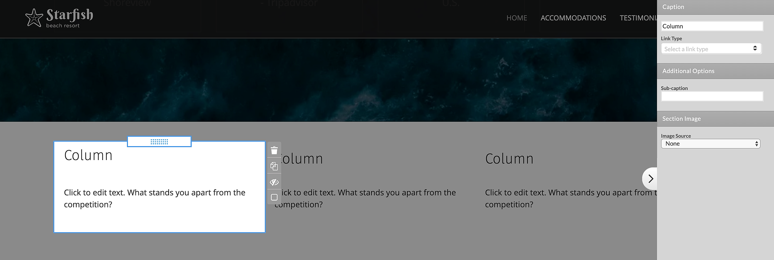
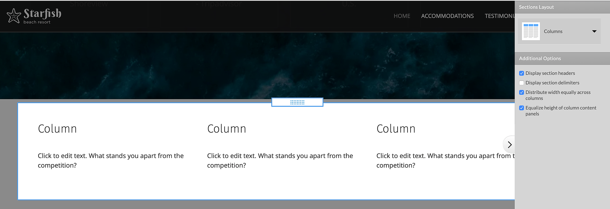
Columns are used for creating open, horizontally oriented content areas. Use these as intro sections including highlights from other pages in the site, for filling up space when your page content is scarce, or to make sections stand out more on the page.
Display section headers: Specify if there will be a Caption.Display section delimiters: Create boundaries between columns.
Distribute width equally across columns: Column width will stay consistent, regardless of the content.
Equalize height of column content panels: By default, Columns are each as tall as the contents. Use this option to automatically equalize the height.
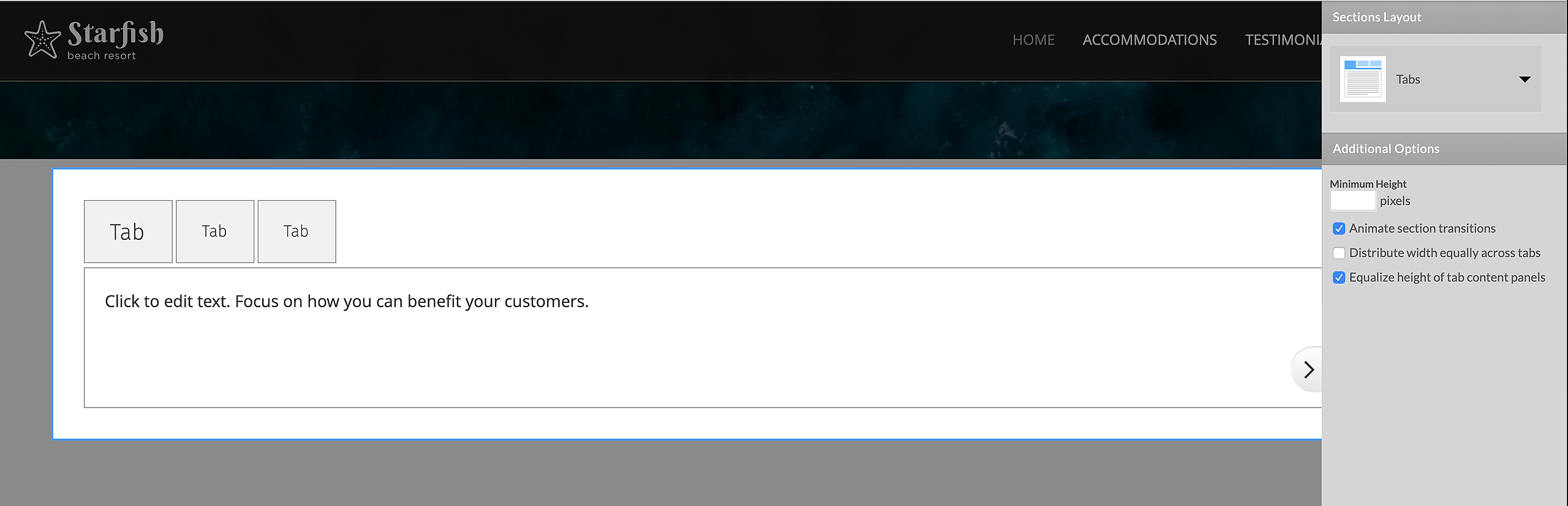
Tabs allow you to fit a lot of content in limited real estate. With tabbed section groups only one section (tab) may be open at a time. By default the first section (tab) will open upon the loading of the page.
Minimum Height in pixels: With Minimum Height applied, all tabs will be at least that tall.
Animate section transitions: A transition effect will be displayed when switching from one tab to another.
Distribute width equally across tabs: Tab width will stay consistent, regardless of the content.
Equalize height of tab content panels: By default, each Tab is only as tall as its content. Use this option to automatically equalize all Tab heights.
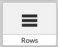
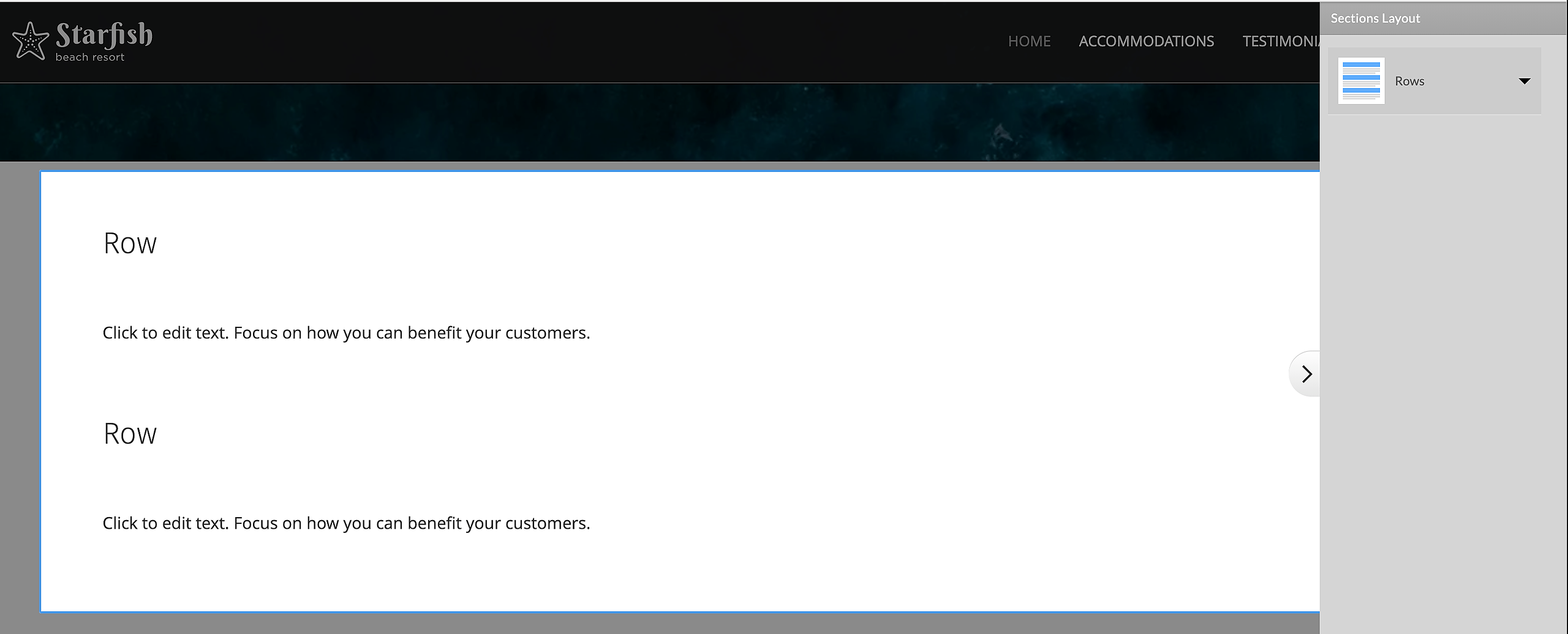
Rows are open content sections stacked on top of each other in a vertical orientation.
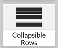
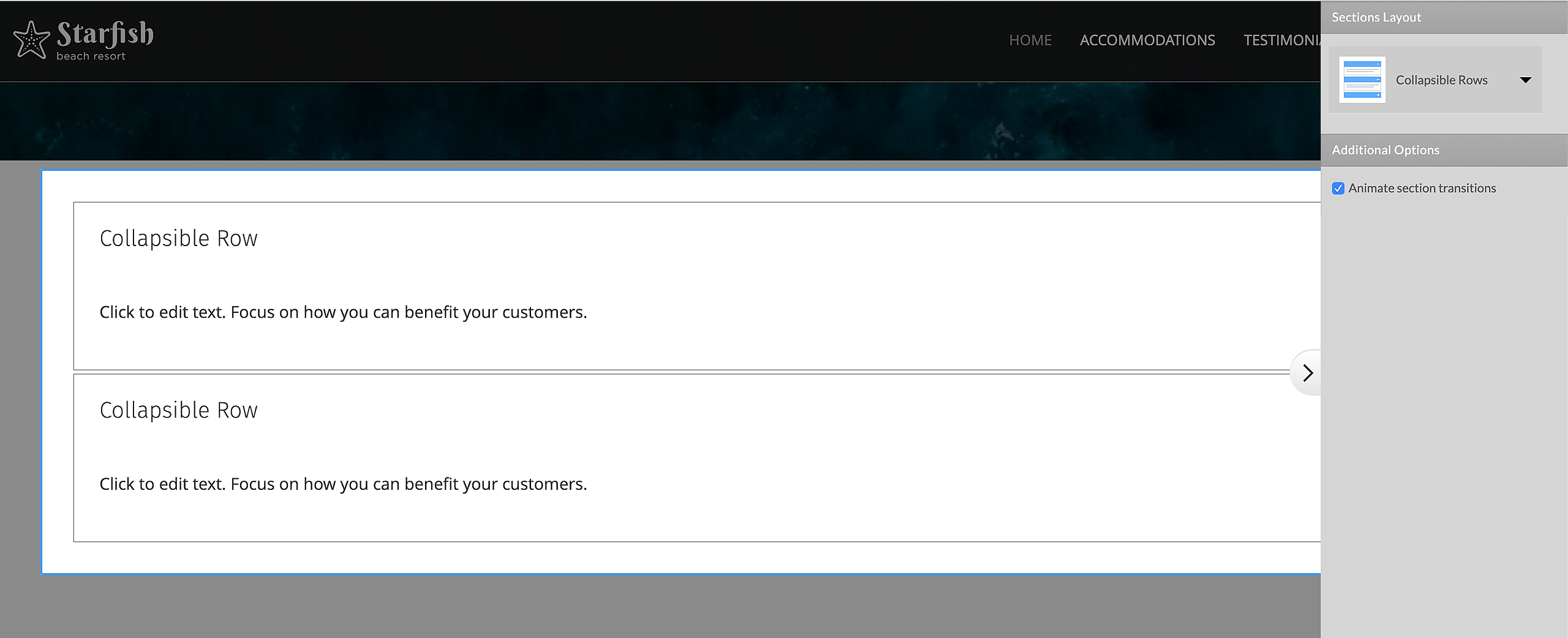
Collapsible Rows can collapse or expand with a nice animation effect. Specify which individual sections will be collapsed or expanded by default.
Animate section transitions (as described under Columns)
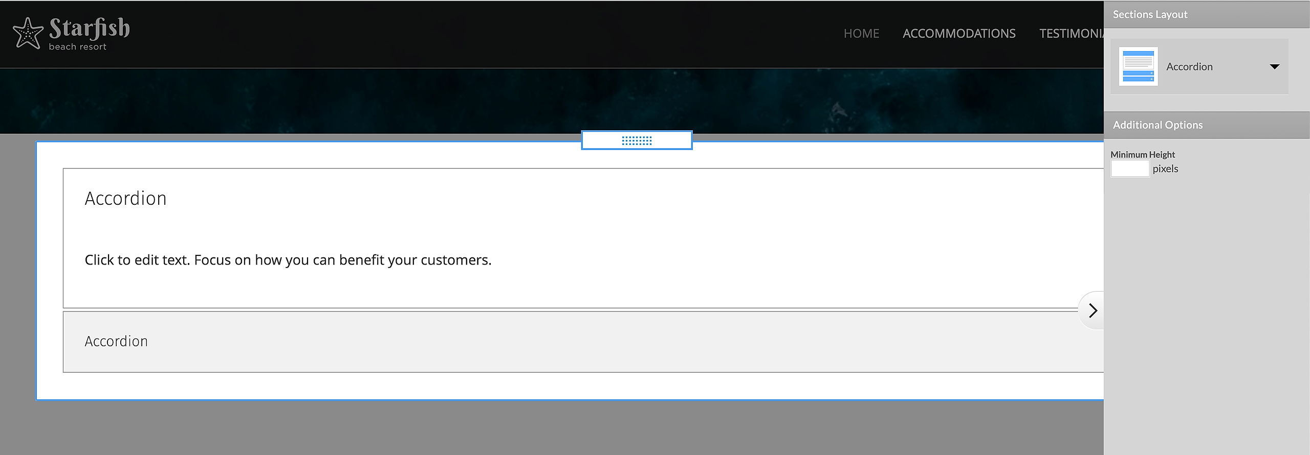
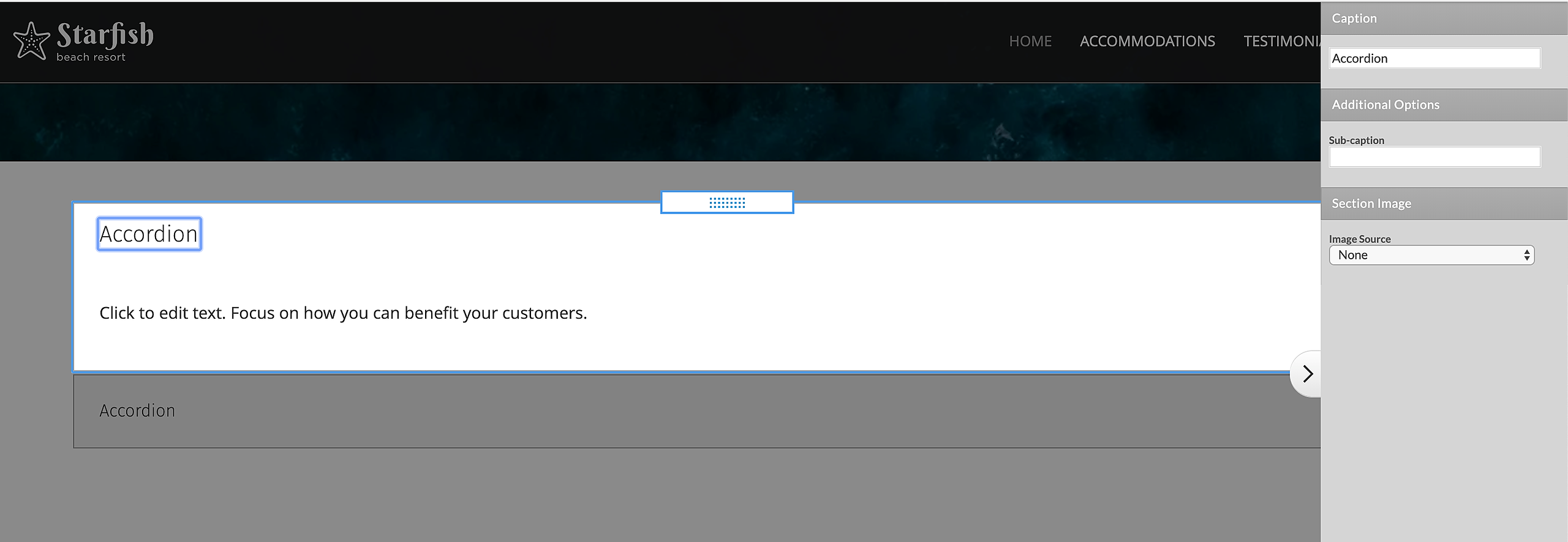
Accordion will display one section at a time. When one section is opened, all others will automatically collapse with a nice animation effect. By default the first section is opened on load of the page.
Minimum Height in pixels (as described under Tabs)
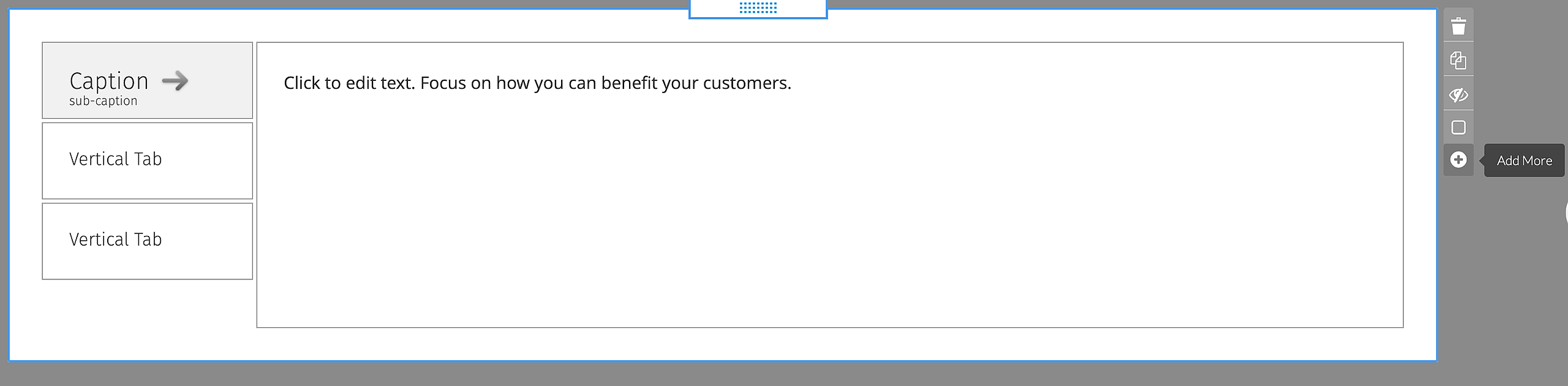
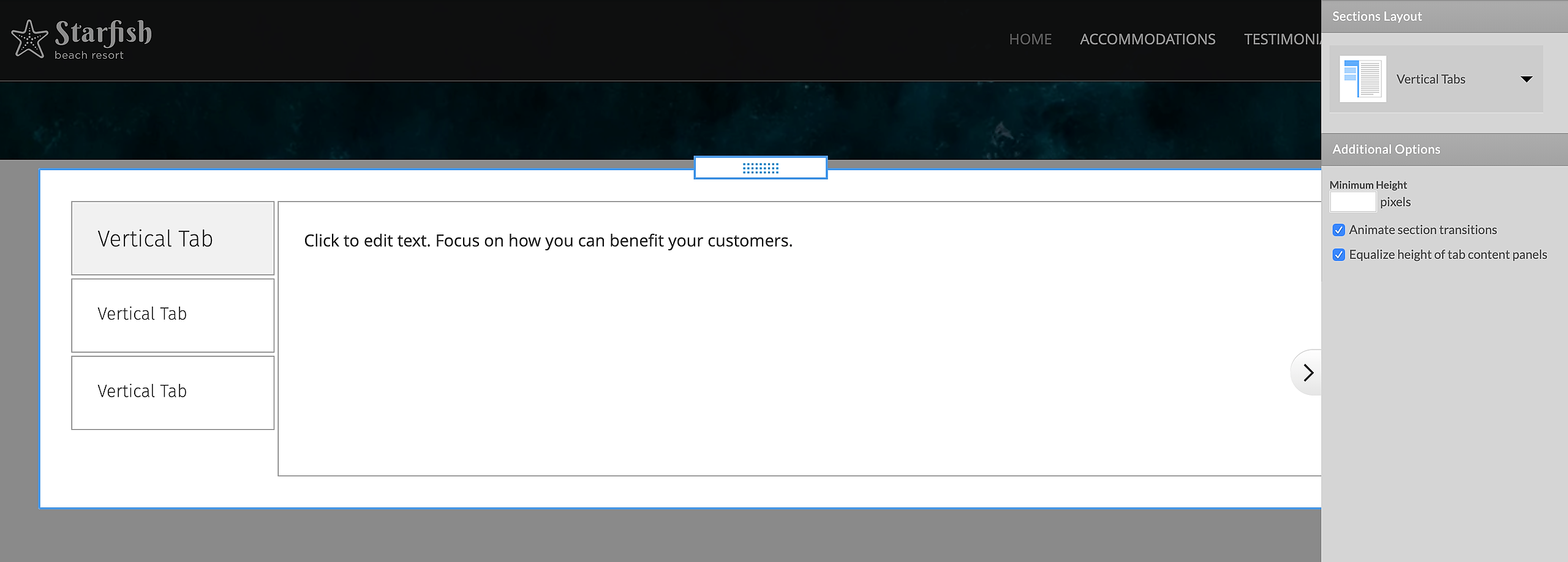
Vertical Tabs can be opened one at a time. By default the first section (tab) will open upon the loading of the page.
Minimum Height in pixels (as described under Tabs)
Animate section transitions (as described under Columns)
Equalize height of tab content panels (as described under Columns)
Sections
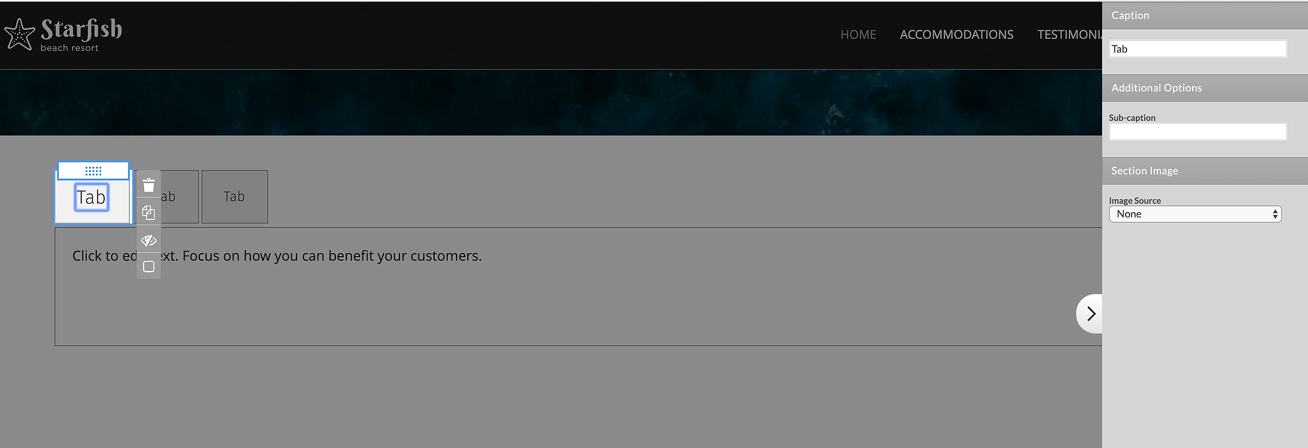
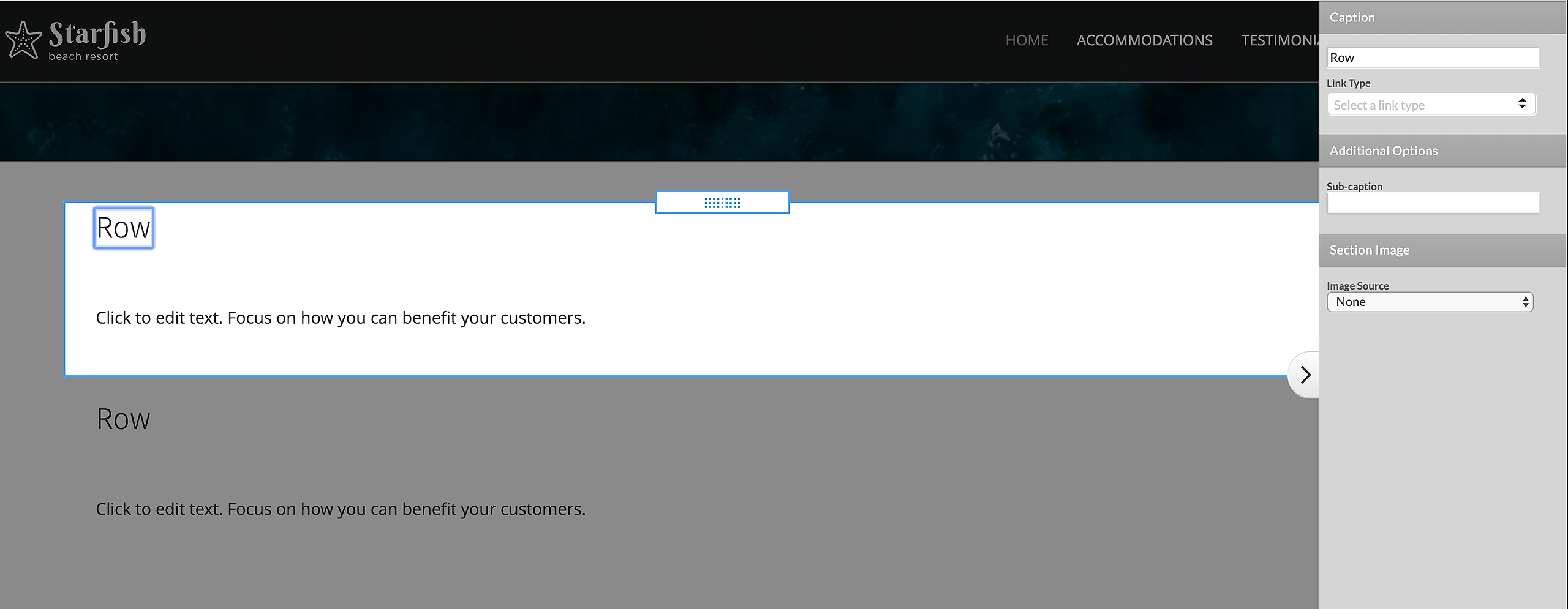
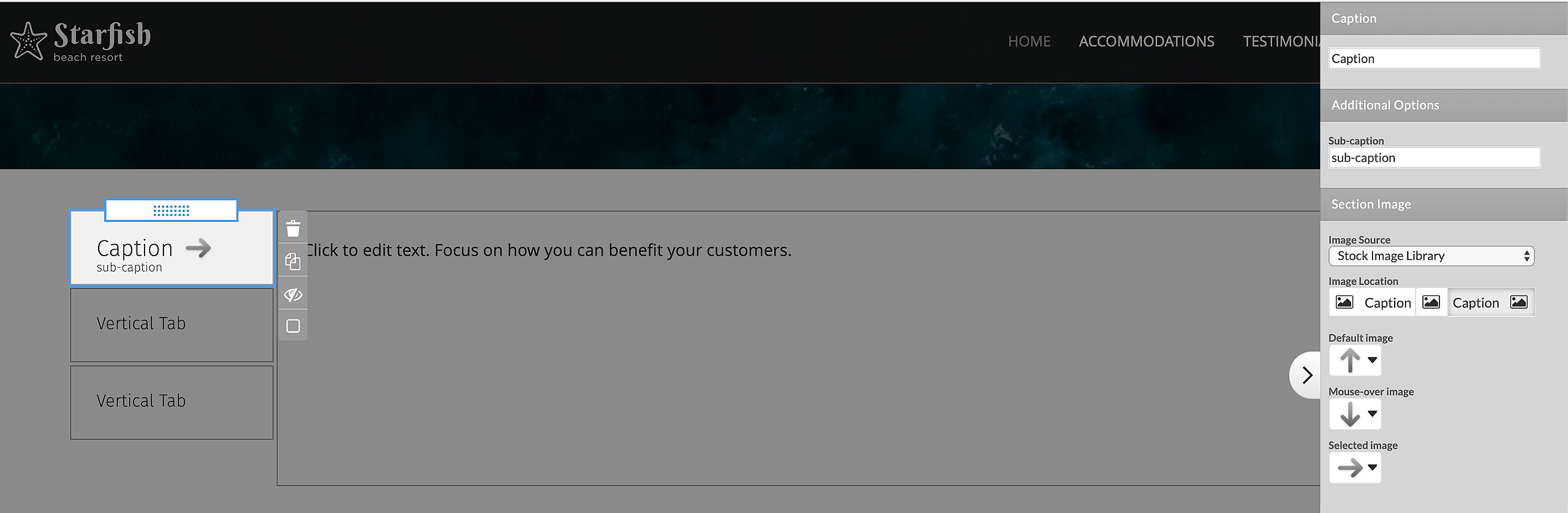
With the Section Group in place, you will see a predefined section in place. You can start editing the Section according to your needs by updating the Section Caption. Simply click on it as described in the beginning.
Link Column or Row captions to internal or external web pages and specify whether they should be opened in the same window, a new window, or in a pop up. You can also enable/disable Search Engines nofollow for every link.
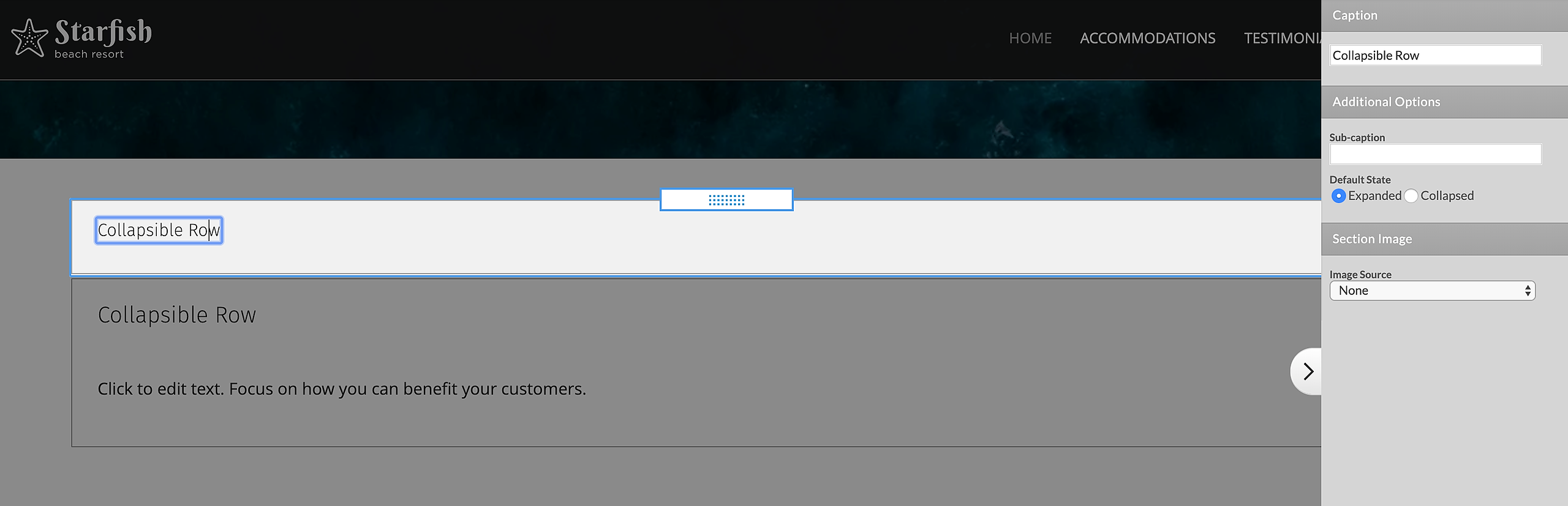
Collapse/expand your section by default (Collapsible Rows only)
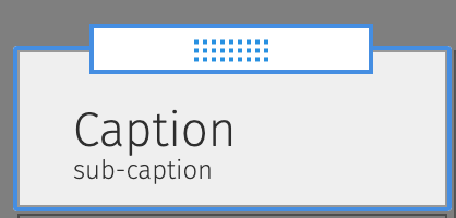
Add a Sub-caption to create a second line of Section header text.
The Fix Width option allows you to define your own width for each of the sections in the Section group. For example, if you want four equal sections, define 25% Fix Width for each of the sections,. If width is not fixed, it will be defined by the width of the section title or section content.
Image Source Choose from our Stock images, or upload your own custom images.
Add a Default image for all Section types.
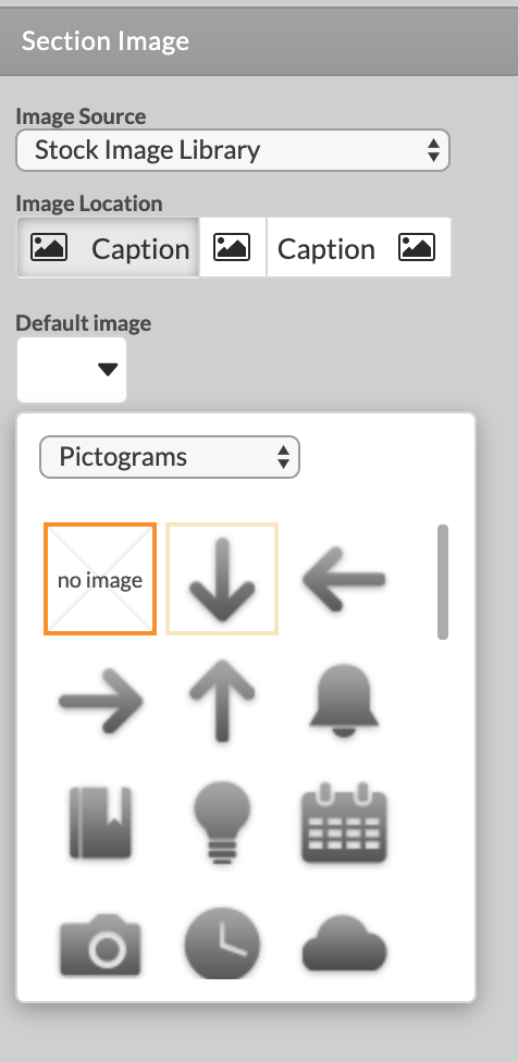
Add Mouse-over and Selected images for the Tabs, Accordions, and Collapsible Rows Layouts.
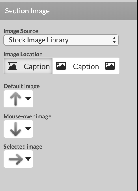
If you don't specify a Selected image, the Mouse-over image will be used in it's place. If there is no Mouse-over image, we will use the Default image.
You can add a Mouse-over image for Columns and Rows Section Captions only if they link to some other page.
Specify Image Location relative to the Caption, or leave out the Caption.
To add more sections to your Section Group just roll over the whole element. Click on the + icon displayed on the right, and another Section Options window will be added ready for editing.