
Image Gallery allows you to easily add and manage the images on your site with different visualizations.
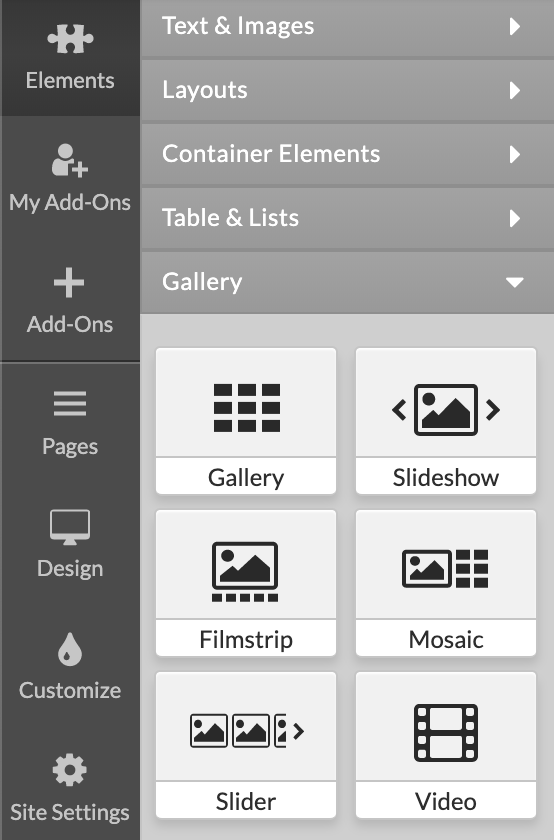
To add a Gallery:
1. Click on Elements in Left Menu.
2. Click on Gallery.
3. Drag and drop one of the available gallery types on the page.
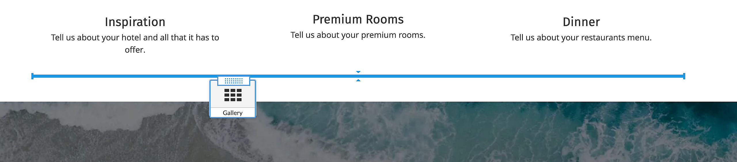
When the element is added on the page you will see Gallery Options menu on the right.
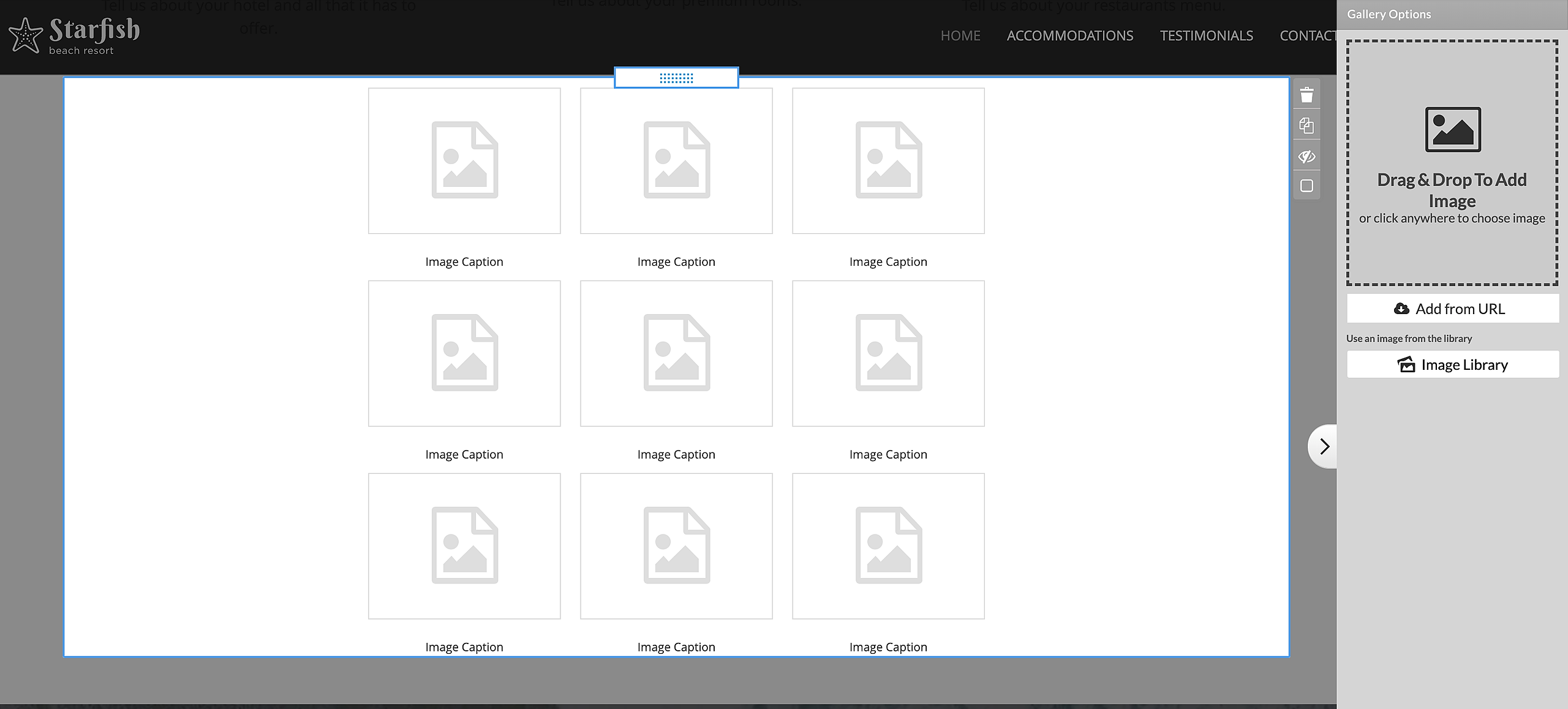
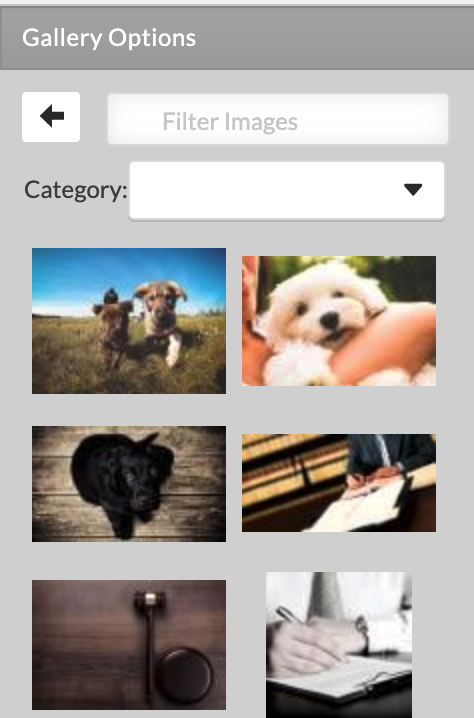
To add an image you have 3 options:*

1. Click on the 'Drag & Drop To Add Image' area or drag and drop an image file in the dashed rectangle to upload single or multiple images.

2. Click on 'Add form URL' to upload an image from a valid URL.
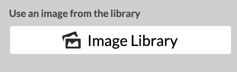
3. Click on the Image Library button to choose from the available stock images.
To edit the settings of a single image you need to mouse over the image preview in right panel and click on the cogwheel icon to access Image Options. To remove single image you need to mouse over the image preview in right panel and click on the bin icon.
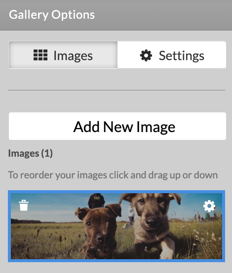
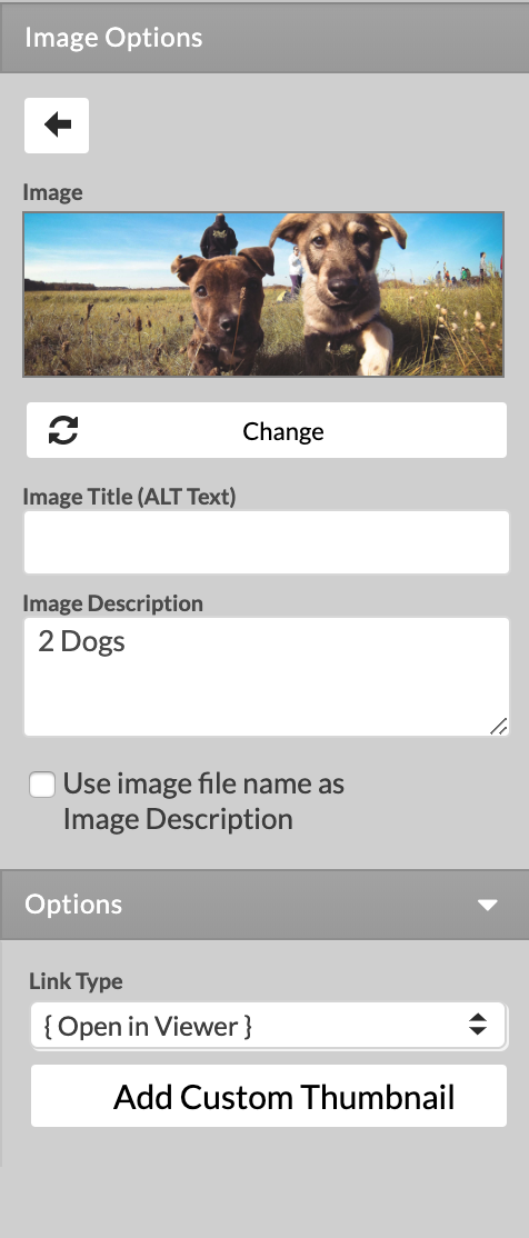
Image Options:
The first things that you see are the back button, which allows to you go back to the Gallery Options and a small preview of the image.
Edit button - the option is available for custom images only, and allows you to modify the image with the built-in editor
Change button - replace the existing image.
Image Title (ALT Text) - used by screen readers and search engines
Image description - a short description for the image and the image caption that is visible on page
Use image file name as Image Description - this will overwrite the 'Image Description' option.
Link Type - you can choose when the images is clicked to open the Large Image Viewer (the original image or just a larger copy of the image) an Internal page or an External page.
Add Custom Thumbnail - adding a custom thumbnail will change the preview image. The original image will only be visible in the Large Image Viewer.
If you click on Settings button you can access Gallery Options and change the gallery type to one of the five available types for the gallery. You can change appearance options, slideshow option, large image viewer, image shapes, image effects.
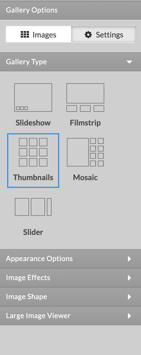
Thumbnails
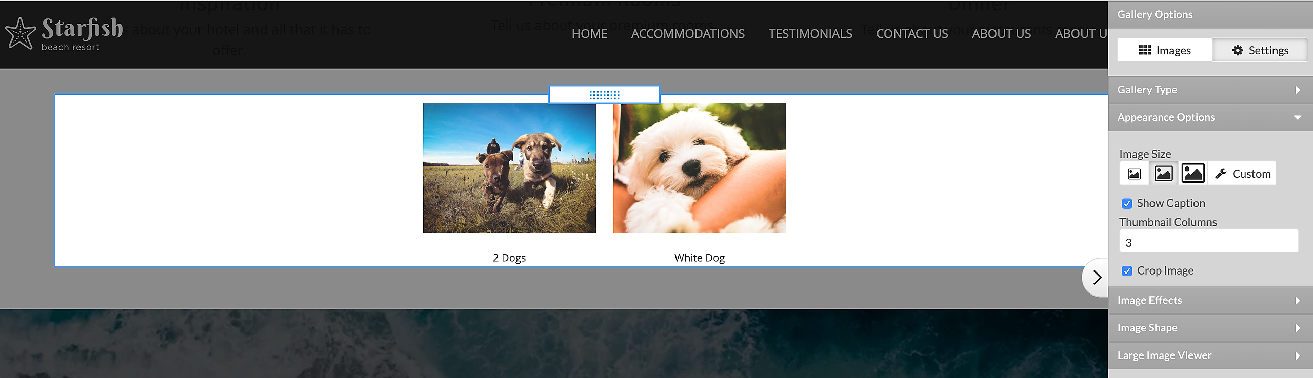
Image size - you can choose from a predefined size (Small, Medium and Large) or set any Custom size that fits your design.
Show Caption - choose to see a caption/description below the image or not.
You can select the number of Thumbnails Columns.
Crop Image - when Crop Image is checked, the uploaded image will be cropped to the aspect ratio of the gallery image size before being resized. When this option is not checked, the uploaded image will preserve its original aspect ratio in the gallery.
Slideshow
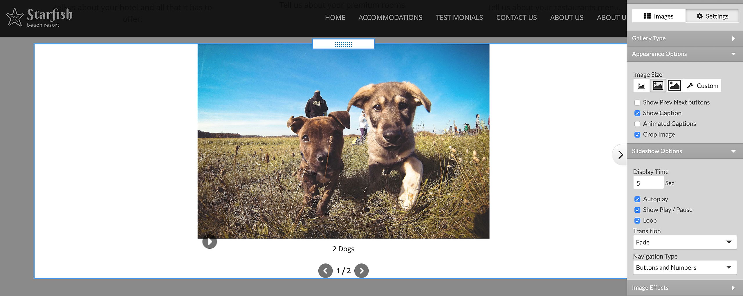
Image size - you can choose from a predefined size (Small, Medium and Large) or set any Custom size that fits your design.
Show Caption - choose to see a caption/description below the image or not.
Animated Captions - choose if the captions should be animated or static (visible only when 'Show Caption' option is enabled).
Crop Image - when Crop Image is checked, the uploaded image will be cropped to the aspect ratio of the gallery image size before being resized. When this option is not checked, the uploaded image will preserve its original aspect ratio in the gallery.
Show Prev Next button - navigation buttons that allow you to switch between gallery images.
Timeout - the delay in seconds that takes the images to automatically change.
Autoplay - you can set the images to switch automatically
Show Play / Pause - the buttons allow you to pause or resume the Autoplay option
Loop - enabling the option will tell the gallery to continue to autoplay, even after reaching the last image.
Transition - you can choose between a Fade or a Slide effect or have no transition effect.
Navigation Type - you can add a navigation option below the image preview - buttons, numbers or both.
Filmstrip
Image size - you can choose from a predefined size (Small, Medium and Large) or set any Custom size that fits your design.
Show Caption - choose to see a caption/description below the image or not.
Crop Image - when Crop Image is checked, the uploaded image will be cropped to the aspect ratio of the gallery image size before being resized. When this option is not checked, the uploaded image will preserve its original aspect ratio in the gallery.
Show Prev Next button - navigation buttons that allow you to switch between gallery images.
Show Scrollbar - you can add a scrollbar to switch between images.
Crop Icon - when Crop Icon is checked, the icons will be cropped to the aspect ratio of the Thumbnail Size before being resized. When this option is not checked, the icons will preserve the original aspect ratio in the gallery.
Set thumbnails (image icon) size in pixels.
Set thumbnails (image icon) position with Thumbnails Placement - Top, Bottom,Left,Right.
Timeout - the delay in seconds that takes the images to automatically change.
Autoplay - you can set the images to switch automatically
Show Play / Pause - the buttons allow you to pause or resume the Autoplay option
Loop - enabling the option will tell the gallery to continue to autoplay, even after reaching the last image.
Transition - you can choose between a Fade or a Slide effect or have no transition effect.
Mosaic
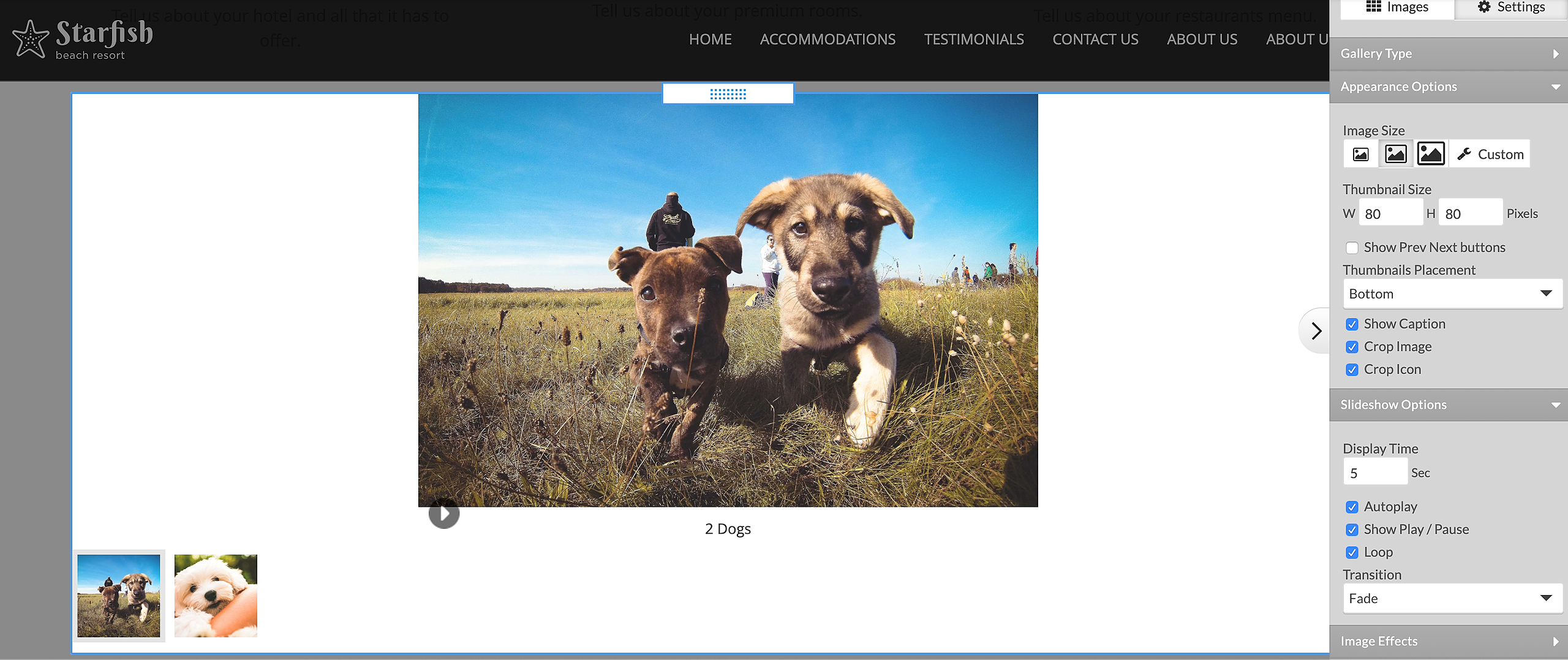
Image size - you can choose from a predefined size (Small, Medium and Large) or set any Custom size that fits your design.
Show Caption - choose to see a caption/description below the image or not.
Crop Image - When Crop Image is checked, the uploaded image will be cropped to the aspect ratio of the gallery image size before being resized. When this option is not checked, the uploaded image will preserve its original aspect ratio in the gallery.
Show Prev Next button - navigation buttons that allow you to switch between gallery images.
Show Scrollbar - you can add a scrollbar to switch between images.
Enable or disable Crop Icon option to shrink image icon.
Set thumbnails (image icon) size in pixels.
Set thumbnails (image icon) position with Thumbnails Placement - Top, Bottom,Left,Right.
Autoplay - you can set the images to switch automatically
Show Play / Pause - the buttons allow you to pause or resume the Autoplay option
Loop - enabling the option will tell the gallery to continue to autoplay, even after reaching the last image.
Transition - you can choose between a Fade or a Slide effect or have no transition effect.
Slider
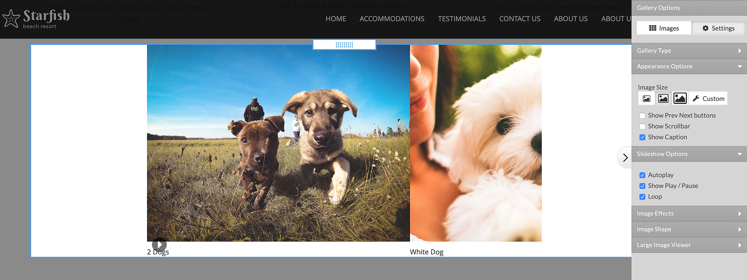
Image size - Small, Medium, Large and Custom.
Show Prev Next button - navigation buttons that allow you to switch between gallery images.
Show Scrollbar - you can add a scrollbar to switch between images.
Show Caption - choose to see a caption/description below the image or not.
Autoplay - you can set the images to switch automatically
Show Play / Pause - the buttons allow you to pause or resume the Autoplay option
Loop - enabling the option will tell the gallery to continue to autoplay, even after reaching the last image.
All Gallery types share the options listed below.
Large Image Viewer is available when the user click on a single image in image preview.
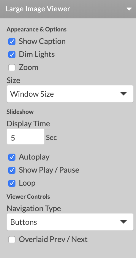
- Show Caption option to enable or disable Image Description text below the image in large image viewer.
- Dim Lights - with the option enabled, the content behind the Large Image Viewer will be dimmed.
- Zoom - if you have a very large image, you will have the option to click on it to zoom
- Size - the size of the Large Image Viewer
Slideshow options:
- Set timeout in seconds - delay between changing images.
- Autoplay - you can set the images to switch automatically
- Show Play / Pause - the buttons allow you to pause or resume the Autoplay option
- Loop - enabling the option will tell the gallery to continue to autoplay, even after reaching the last image.
- Set Navigation type to buttons,
- Overlay Prev / Next arrow buttons to navigate between the images.
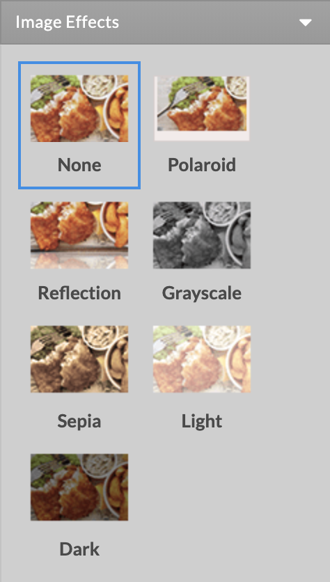
Image Effects.(Not applied in Large Image Viewer)
You can change the image preview effect. The available options are:
- None
- Polaroid
- Reflection
- Grayscale
- Sepia
- Light
- Dark
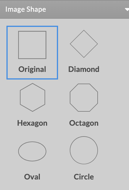
Image Shapes.(Not applied in Large Image Viewer)
You can change the image preview shape. Available shapes are:
- Original
- Diamond
- Hexagon
- Octagon
- Oval
- Circle
*Note: There is no option to upload zip files with images. There is a limit of 200 images per upload.