
Using a simple Form editor you can easily create different types of web Forms that can help you interact with your site visitors or gather user information. The Form editor is very similar to the Text and Image editor, but has a set of additional options for customizing your forms. It lets you add all types of form fields you may need, and arrange them as you like to create any type of web form - Feedback form, Product / Service Information Request forms, Subscription forms, Surveys, Questionnaires and more.
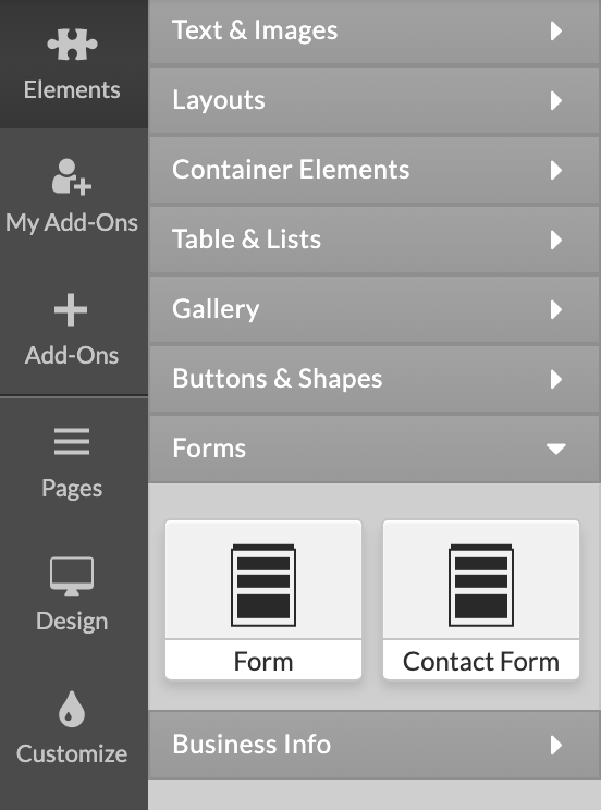
To add a Form to your website simply click Elements > Forms at the Left Menu and drag-and-drop the element on page. Blue rectangles will appear to indicate the locations where a form may be dropped.
There are two ends in the Form editor - Layout and Form Properties. In the Layout you will configure the Form content, fields, checkboxes, radio buttons, and the Call To Action Button required for submitting the form. In the Form Properties section you will specify what happens when a visitor Submits the form - send to email, send confirmation email, send to database.
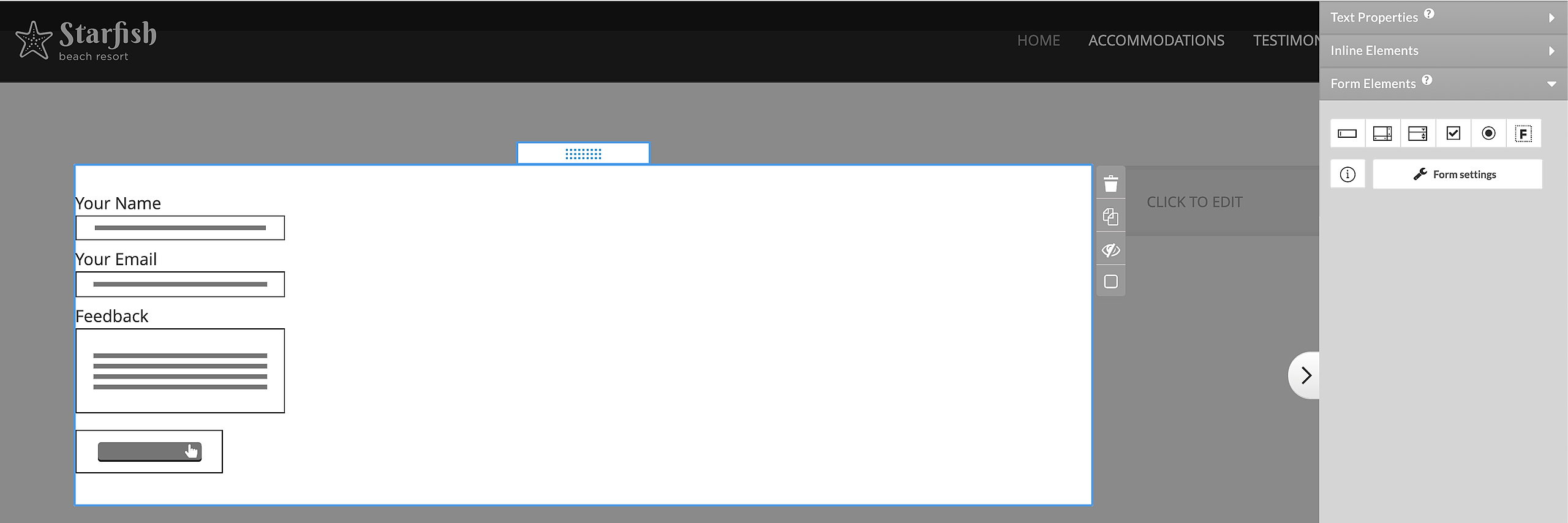
Layout - Types of fields, checkboxes and buttons
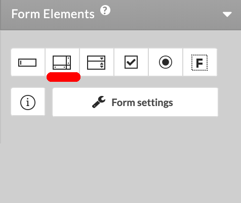
1. Text Field
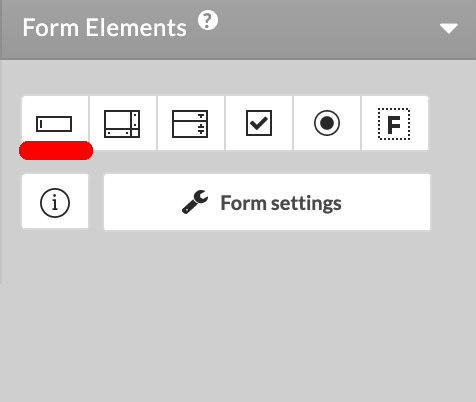
The Text Field may be used in your form to type text which is fairly short, and does not need to be split in lines. To add a Text Field press the
button from the Form editor tools menu. Now click over the Text Field you have added and you will see a set of options displayed in the right pane of the Form editor.
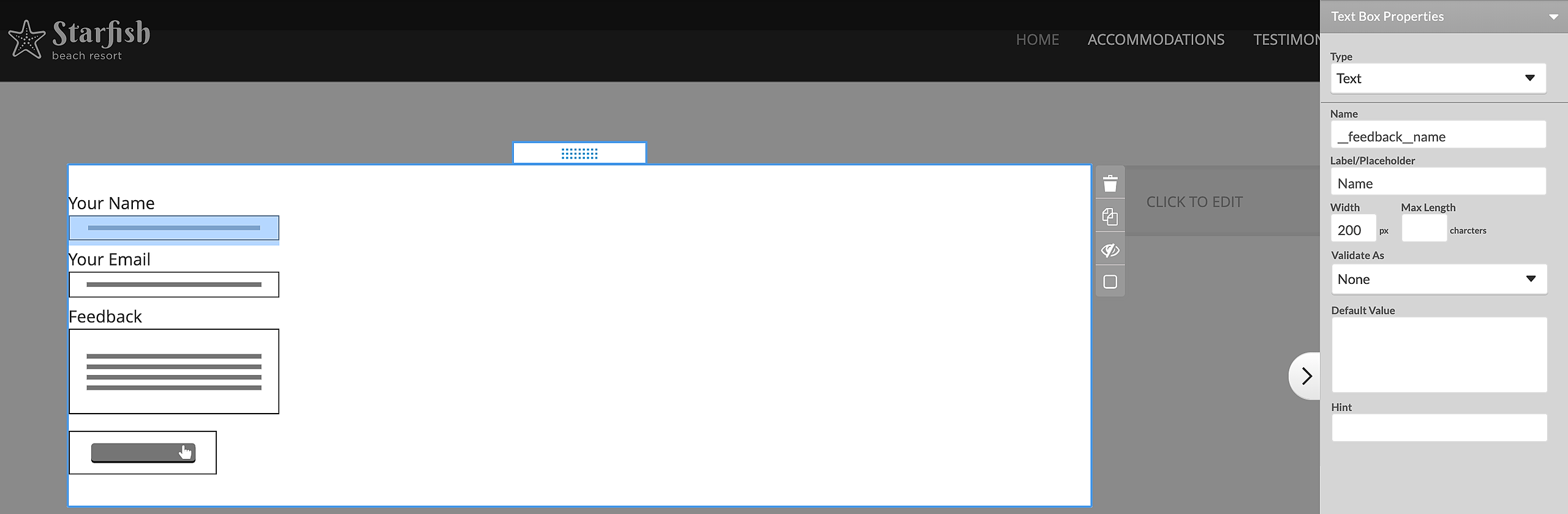
Type determines what information users should fill into this field.
Text: the text users fill in will appear just as they typed it
Password: the text will appear as **** so other users may not see it
Hidden: can be used when you need to gather system-related information (like IP or browser used to submit the form) or add data which users should not see. A hidden field will not be visible on the page.
File*: visitors can upload image, audio, video and other binary files to your site. When your site visitors submit to the form on your site you will receive an email with the information and a click-able link to the "File" they uploaded.
Name is used to identify the form field when you need to refer to it anywhere inside the form editor as well as in the email / blog entry generated by this form. That is why each form field should have a unique Name.
The Width of the text box either by typing a different width number or by just dragging the resize controls of the field text box (the resize controls will appear when you click over the form field).
Max Length is the maximum number of symbols this form field can accept. Your form may visually be very short, but it will accept as many symbols as you define in Max Length.
Validate As field will let you define the type of content users are required to fill into this form field. If they don't fill in the proper content type - they won't be able to submit the form. E.g your form field Email may be validated to accept just content type Email. Thus if some user submits a form with incorrect email address (like me@yahoo or meyahoo.com) on trying to submit of the form the user will see a notice to correct the email. Most fields in the Form editor have Validate As option.
Hint is the text that will appear next to the field when the visitor clicks inside it. You can enter instructions or examples of the content that needs to be entered.
Default Value - This value will be pre-filled upon opening of the form and the visitor will be able to change it. The following special strings will be replaced with the corresponding values:
$date - Date in format YYYY-MM-DD
$date_time - Date and time in format YYYY-MM-DD HH:MM
$browser_ver - Browser version and type of operating syste
$referrer - The page the visitor came from (referrer page)
$ip - Visitor's IP address
*Files - In order to preserve the files sent via web form, the Form needs to be connected with a Database. Files that become part of the database will use the account storage and will remain accessible as long as they are in the Database. File links that are sent to an email do not use account space and therefore will expire in 2 weeks.
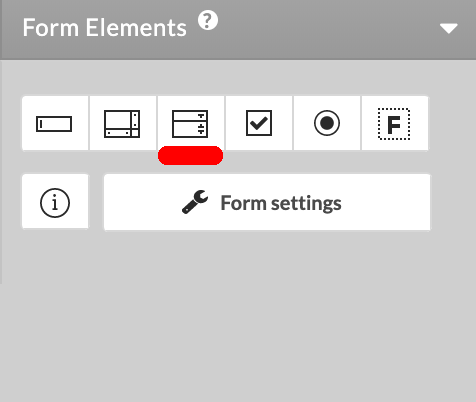
2. Text Area
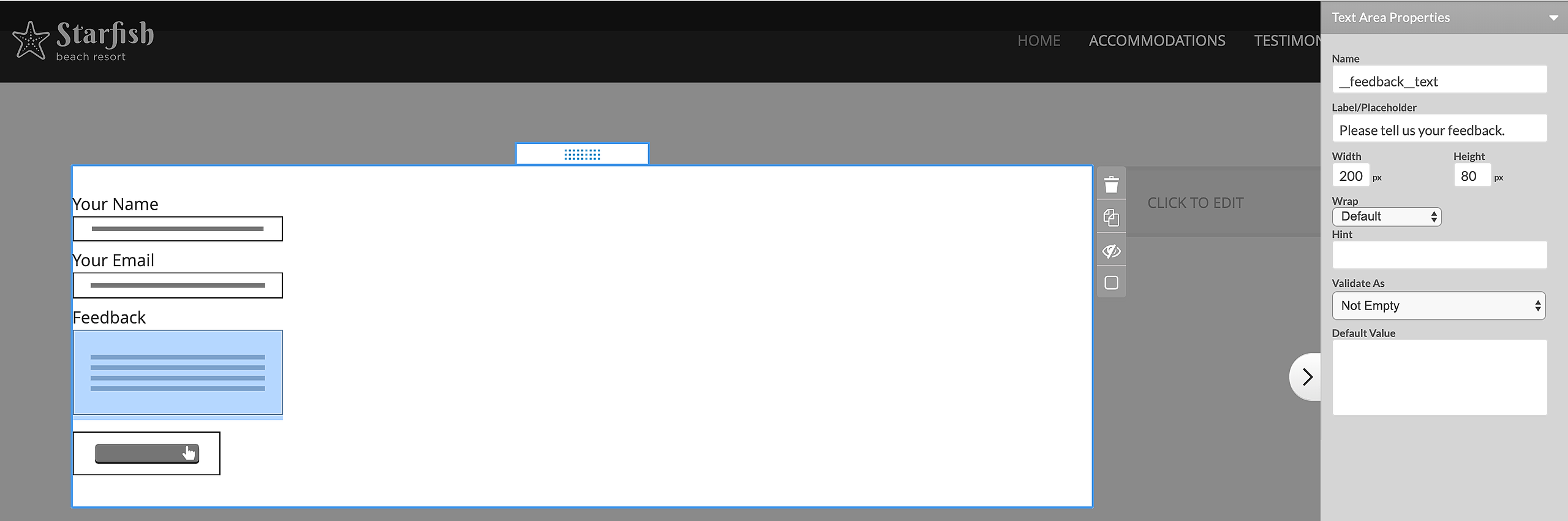
The Text Area form field is similar to the Text Field but can hold longer, multi-line text. Add a Text Area from the form editor. Click over the Text Area field you have added to see its customization options displayed to the right. The options Name, Width, Hint, Validate As and Default Value are identical to those of the Text Field. In addition, here we have:
Height of the text area - you may change it either by changing the number in the height field or by dragging the text area size controls.
Wrap - defines the wrapping of the submitted form field text when displayed in an email or forum / blog. Choose Default value to have your browser and mail client (Outlook, etc) wrap the text according to their default settings. Set wrapping Off to disallow the wrapping of the text when it is typed. Choose Physical to display the text in the mail the way it was wrapped in the text area. Choose Virtual to allow the mail client to decide how exactly the text should be wrapped.
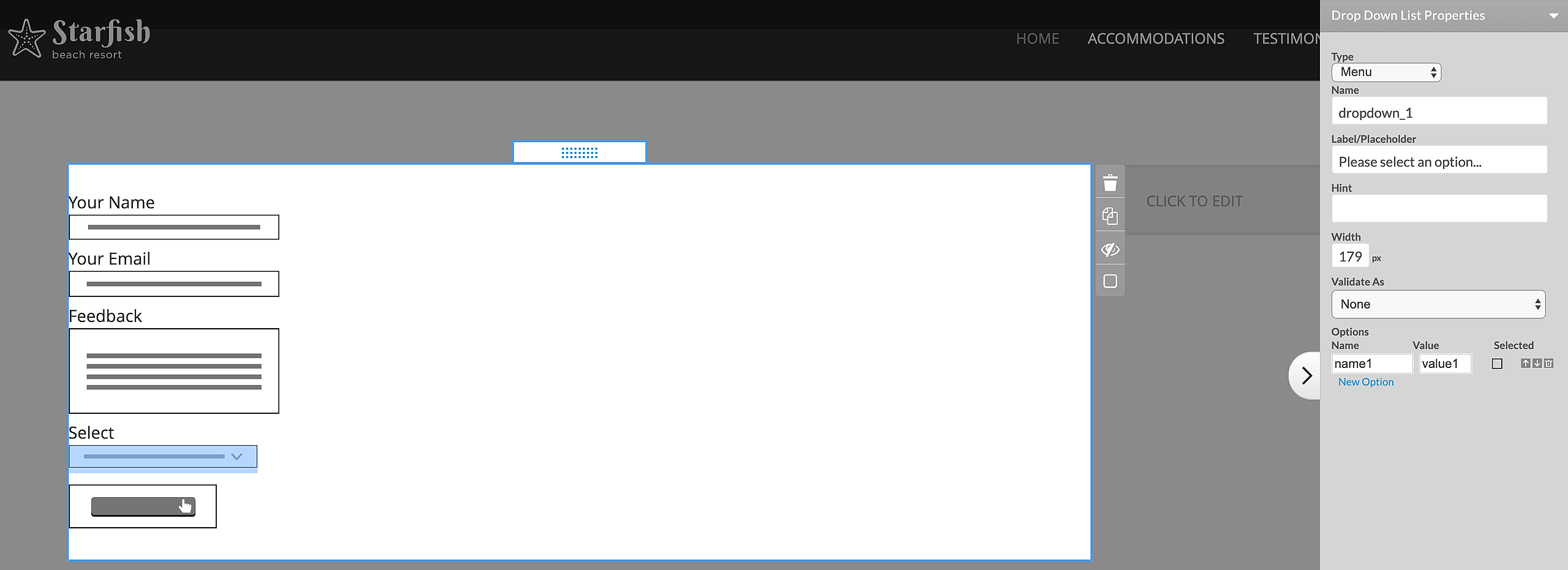
3. Select Field
The Select Field is a box with a dropdown list inside, or a box with several options displayed one below the other. Add a Select field from the Form Editor. Click on the select field you have just added and you will see its properties again to the right. The options displayed here are:
Type - if you choose Menu type the select field will be a dropdown with options. If List is selected, the available field options will be listed one below the other.
The Options will be displayed as variants for selection in your Select Field. The Option Name is the exact text to appear in the dropdown / list, and the Option Value is the text that will be sent to you in an email or posted to a forum when the respective option is selected. Using up/down arrows you may rearrange the options in the dropdown or list. You may also delete options as well as choose a specific option to be selected by default.
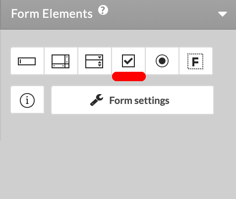
4. Checkboxes
Checkboxes are used when there is a list of possible options and the user may select any number of choices from them. A stand-alone checkbox may also be used for a single option that the user may turn on or off.
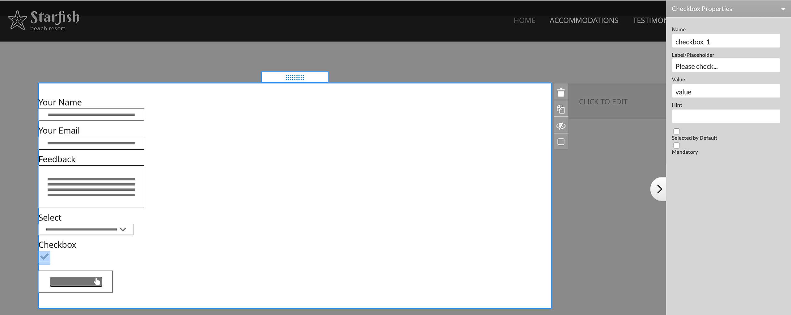
Add a checkbox from the form editor > and select it to see the customization options in the right pane.
The checkboxes, just like all other form fields, have a Name which identifies the field in the form template editor as well as in the email/blog entry generated by this form. You may consider the Name as the question your users will have to answer by checking or un-checking the checkboxes associated with it.
The Value of the checkbox is the answer you will get on your question. I.e if you set the checkbox value to Yes when the users checked this checkbox this means they answered your question affirmatively.
If you check the Selected by Default option, your checkbox form field will be initially checked when the users load your form.
And finally, if you make a checkbox mandatory users will be required to check it before being able to submit the form. e.g if you want them to agree to your Terms and Conditions before they may submit the form - add an Agreement checkbox and make it Mandatory.
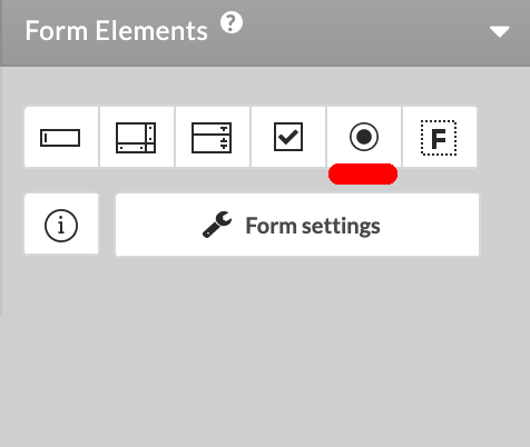
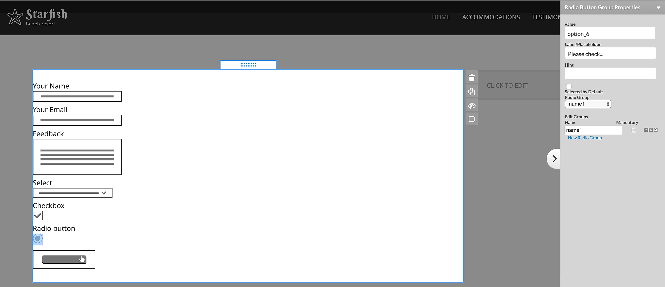
5. Radio buttons
Radio buttons are used when there is a list of several mutually exclusive options - i.e. the user can select just one option out of all available. Add a radio button from the form editor > Radio Button. Now click the radio button to see the customization options for it displayed to the right.
All radio buttons representing the options for one and the same question must belong to the same Group. I.e. the Groups are the questions which will have radio button answers. At any time only one radio button from a group may be selected - clicking another radio button will deselect the previously selected radio button in this group.
The Values of the radio buttons are the actual answers to your questions. The value gets posted in the email / forum when this radio button is selected. Imagine your question was Do you like my site and you want to give the users 3 options: Yes, No and Needs more work. Your radio button group may then be named 'LikeMySite' and the Values of the radio buttons will be Yes, No and Needs work. If a user selects the radio button with value Yes, in the email or forum where the results of the form get posted you will receive this information as LikeMySite: Yes
The Default State and Mandatory options work the same way as described for the checkbox field.
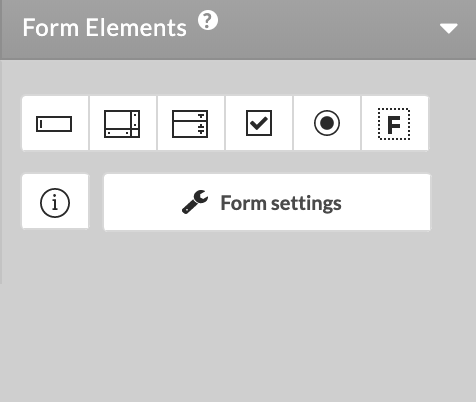
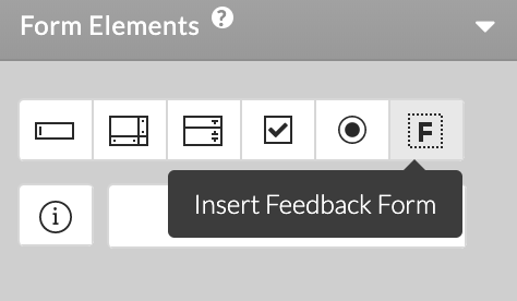
6. Feedback Form Wizard
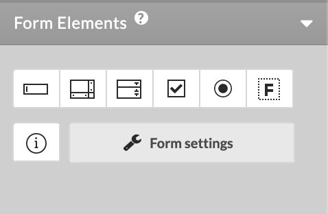
The Form editor features a ready form wizard for Feedback. You can add it using the F icon. It comes with the necessary for this type of form submission fields, complete with a Call To Action button. The fields have predefined settings that you can modify if necessary.
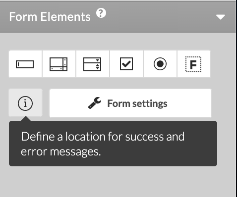
7. Location of Success and Error messages
After submission of the Form the system displays success or error message. The Form allows you to specify the location on the succession and error messages, depending on where in the editor you add them. Use the Info icon to specify the desired location.
The Form Properties also allows you to specify a custom Success message, when Advanced Options are enabled. If you leave the field blank, the system will display the default success message, otherwise you can input the desired notice to be displayed to your website visitors.
NOTE: The custom Success message options is not available if the form is configured to redirect the site visitor to another page.
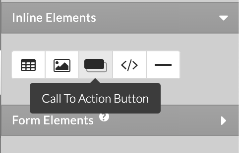
8. Call To Action button
The Call To Action button is essential to the Form. Without it your users cannot submit the form and it cannot complete its actions.
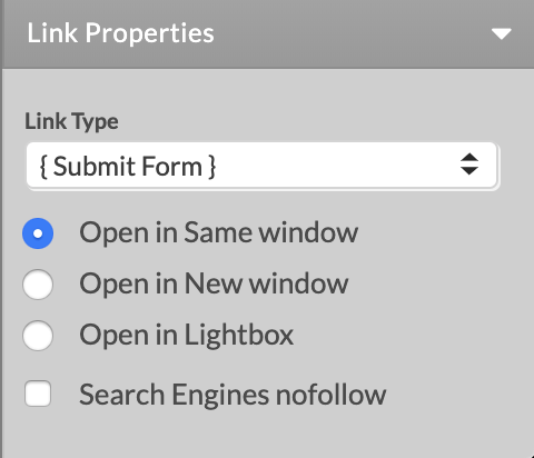
To insert the Call To Action button, click on its icon found under Inline Elements of the Form editor toolbar. To make it a Call To Action button for sending a form, click on it and from the Link drop-down menu select {Submit Form}. You can create a Form {Reset} button using the same process. Use the editable field in the right panel to change the Caption text the button will display.
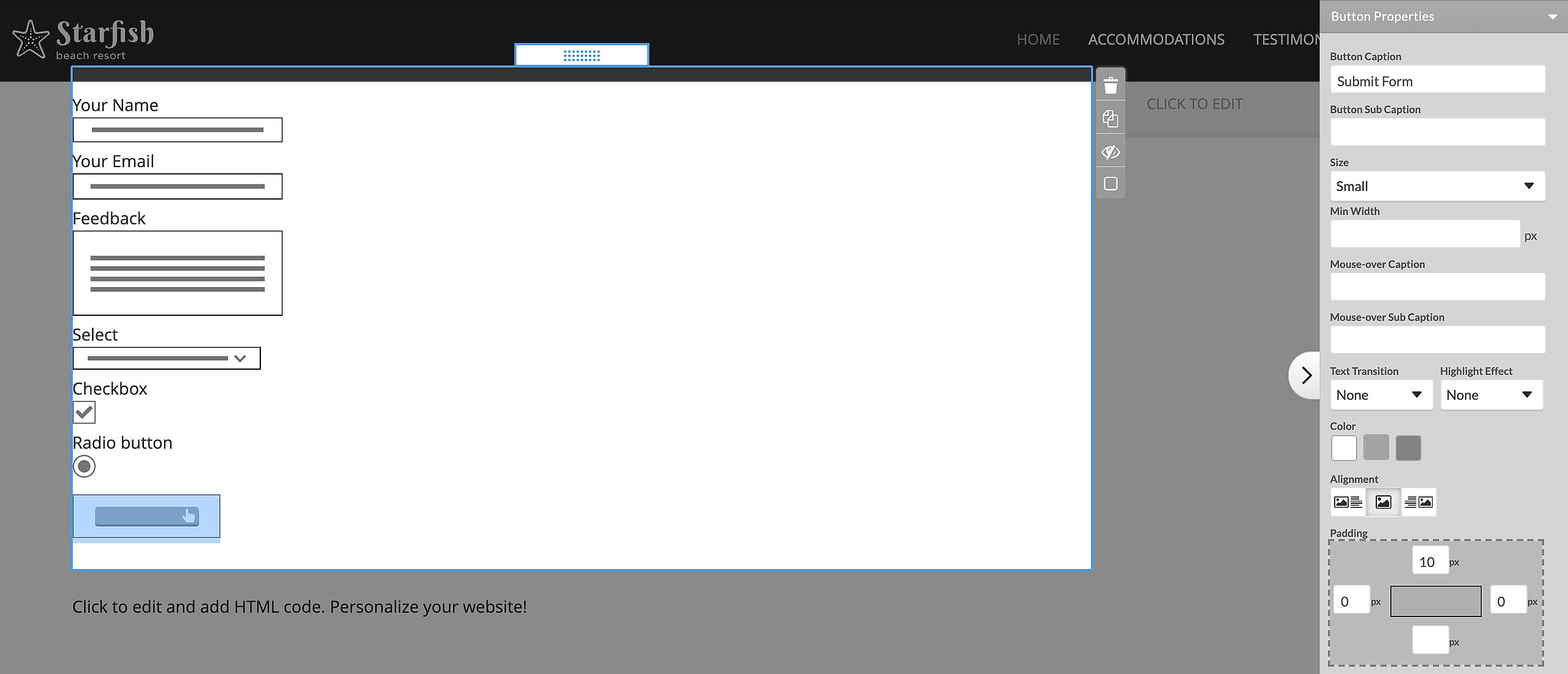
Call to Action Button Properties and Layout
Button Caption and Sub Caption: Define the text that will be visible on the button.
Size: Choose from three pre-defined button sized - small, medium, large.
Min Width: Define a minimum width for the button.
Mouse-over Caption and Sub Caption: Define the text that will be visible on the button on mouse-over.
Text Transition: If mouse-over caption is set, you can define a special visual transition.
Highlight Effect: You can define an animation effect. If applied to the button, it will appear 3 seconds after the page is loaded and it will be repeated on every 30 seconds.
Color: Choose from three pre-defined colors for the button.
Alignment: Specify the button alignment inside the content - left, centered, right.
Padding: Apply custom padding around the buttons inside the content in pixels.
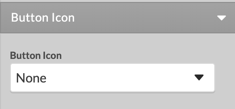
Button Icon: You can set a custom icon to the button, by choosing between a Stock Image Library image or upload a custom one. You can upload only Default Icon or add a Mouse-over Icon as well.
Icon Location: Set the custom icon to be before or after the Button Caption.
Form Properties
Access the Form Properties by clicking on Form Settings button.
1. Next Page: define which page from your site should open after successful submission of the form (it may be a 'Thank You' page for example) or leave empty.
2. Send to Email
To send the content of your form to your email enable the Send to Email ON to expand all options in this section.
To Email: Specify the address To which submitted forms should be addressed. We can display customer submitted details by applying $xxxxx$ wildcards for the special values of the corresponding Form Field Name.
From Email: Specify the address From which the form will be sent. This can be your own specific email address, or we can display customer submitted details by applying $xxxxx$ wildcards for the special values of the corresponding Form Field Name.
Mail Subject: of the email that will be received on submission of the form (like New Information Request). We can display customer submitted details by applying $xxxxx$ wildcards for the special values of the corresponding Form Field Name.
Advanced Options - Site Properties
Advanced Options may need to be enabled to reveal all available Form Properties.
3. Format: of the mail.
If Plain is selected any formatting will be lost.
If HTML is selected the submitted email will be displayed in HTML format if your mail client supports this option.
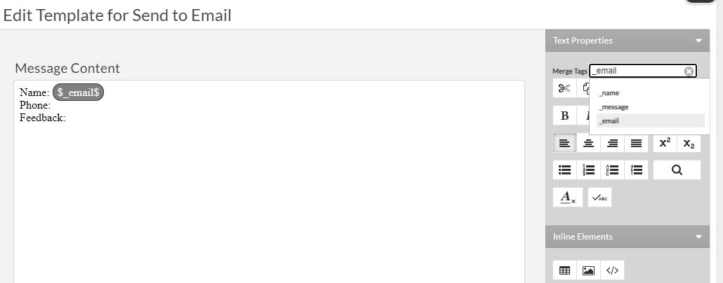
To display additional information and/or apply special formatting to the mail containing the form data submitted, choose Use Template option and a Template Editor will open.
The Template Editor resembles a simplified Text and Image editor, and has its own Save and Cancel links which will let you save the template or go back to the Form editor. The Template Editor will let you apply your own formatting and include in the email body the value of any field from the form. Use the Value dropdown on top right of the Template Editor to insert placeholders for the desired field values in your template. You will see that all form fields you have added to your form appear in this dropdown referenced by their Name. After your template is ready and saved, each submission of your form will result in an email sent to your email, and the content of the email will follow the content structure you have set in your Template.
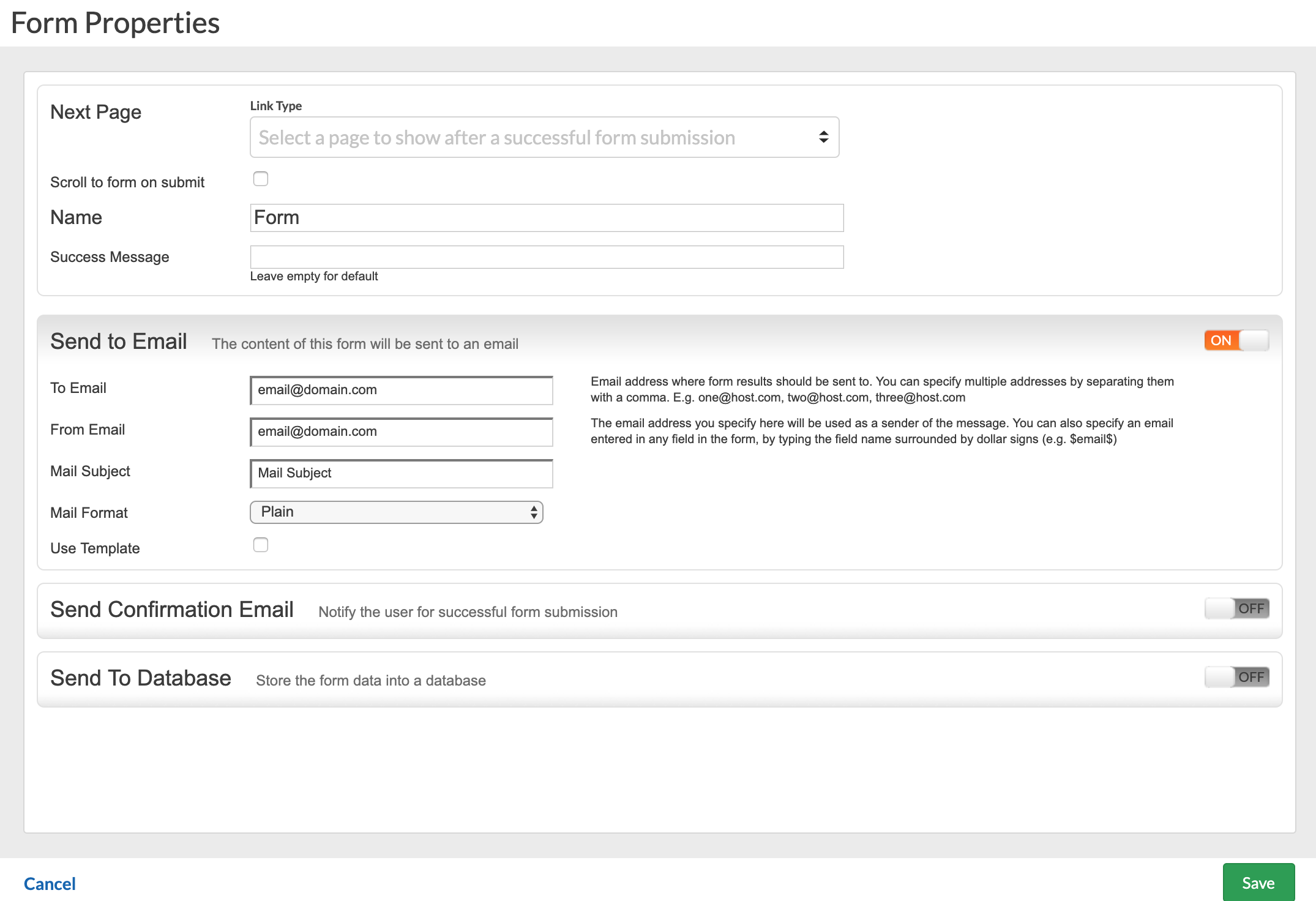
4. Send Confirmation Email
This action allows you to send a timely response to your visitors notifying that their information has been properly submitted and will be processed shortly. To Email drop-down lets you specify the field to be used for email data. The field will be filled in with your visitor's email address, and the Form will use it to send the confirmation email to it. Enter the email address from which this confirmation message will appear to be sent in your visitor's mailbox. Specify its subject. Finally, you have the option to edit the confirmation message itself, clicking the Template > Edit link. It will open a simple Text Template editor to be used to devise your message. Save the template when you are done using the Save button on the Template Editor.
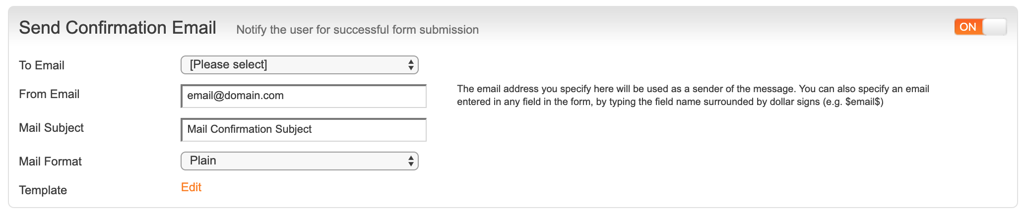
Finally, you have the option to edit the confirmation message itself, clicking the Template > Edit link. It will open a simple Text Template editor to be used to devise your message. Save the template when you are done using the Save button on the Template Editor. Please note that the template option requires each field to be added using $tags$. For example, you wish to add the "Email" field to the template, to do so click on "Merge Tags" on the right and select the corresponding tag. A correctly configured tag will receive a dark background. This applies for the "Confirmation Email" template as well.
5. Send to Database
By selecting the Send to Database checkbox all form-fields submitted through your form will be added to a database on your site. The Form will create its own database, with all necessary columns of the type it needs. This data is accessible along with the Database Editor application. You can also use an imported database, but before setting up the Form to use the imported database, make sure it has all necessary columns of type and name exactly as the type and name your Form fields use. For more details visit our Database Editor application tutorial.
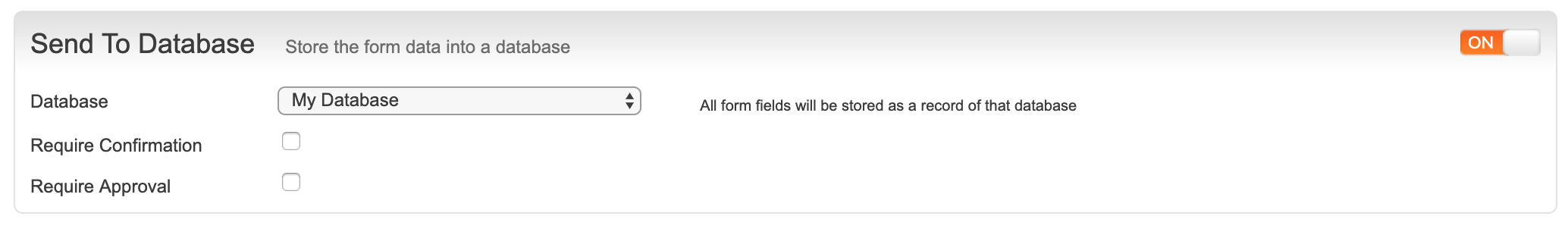
If you check the option Requires Confirmation, your visitors will receive an email with a link they need to click to confirm their entry. Checking this option will open a To Email drop-down, asking you to specify the email field from the Form. The email address your visitor enters in that field will be used to send the confirmation email with the confirmation link.
If you check the option Require Approval, you will need to also enter email address for the moderator. The moderator will be sent an email upon submission of the Form, asking him to click on a link to approve this entry in a database. This function is useful to guard against spam submissions or accident submissions from visitors.
Common errors:
SCM-156 - Please check in "Form Properties", under "Send to Email" that there is an email address in the "From Email" field. If the field is using a $tag$, please make sure the data inside the tag matches the name of the email field, a correctly configured tag will have a dark grey background. Another cause for this error is an empty space before/after the entered email addresses.
"I submitted the form but the data is missing" - This is usually because the "Template" option is enabled, but the template itself is not configured. Please refer to the "Form Properties" section of this article.