
Main Navigation
The main navigation area has a number of different position, type and sub-menu appearance settings. To change the navigation area settings rollover your main navigation and click on an empty space within the blue rectangle. On the right a new panel will open with the Navigation Properties. From there you can change the Menu Alignment, Sub-Menu Appearance and Sub-Menu Animation.
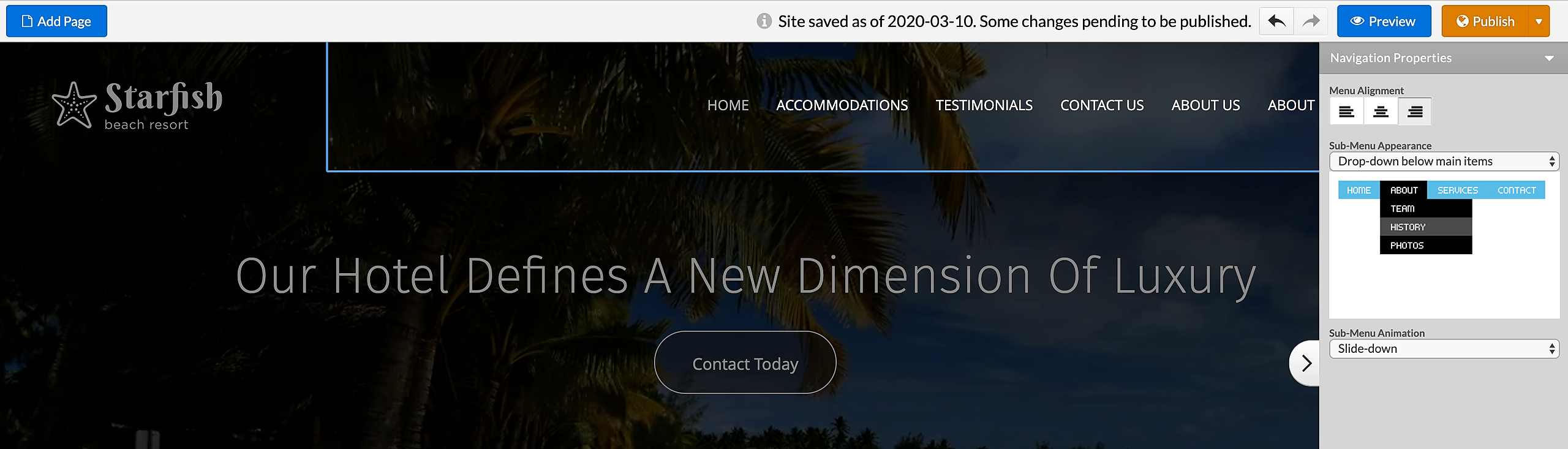
The changes that you make will directly reflect on your page. To save the changes, simply click anywhere outside of the navigation area. To cancel the changes, press the ESC key on your keyboard.
Here is how the settings will affect the appearance of your navigation area:
Menu Alignment: different alignment (left, right and center) options are available only with the horizontal main navigations.
Sub-Menu Appearance*: if your main menu is positioned on top, the sub-menu items may appear horizontally aligned below the main menu items, or in a vertical drop-down. If the main menu is positioned on the left, the sub-menu may only appear vertically, either below its main menu item or to the right of it.
Sub-Menu Animation*: this is the animation effect used to display the sub-menu items. The available options are: slide down, fade in, no animation.
Navigation areas may not be deleted, but you can always delete all menu items inside them.
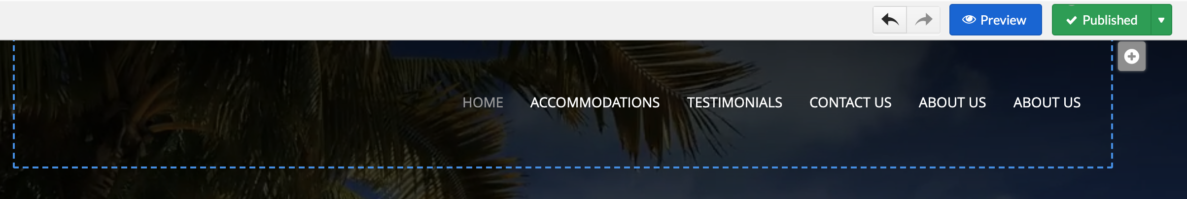
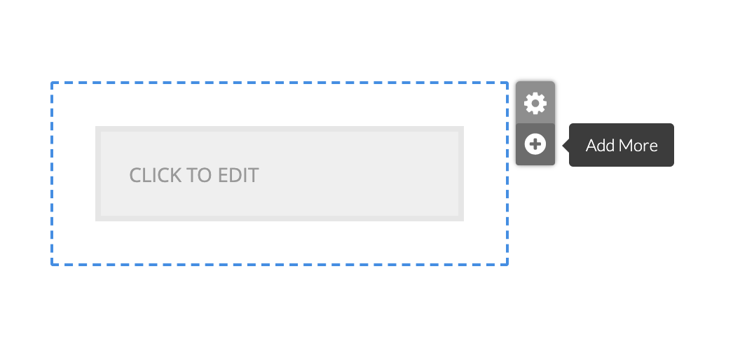
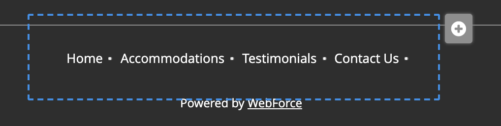
Start adding navigation items by rolling it over the main navigation and clicking the plus icon. Depending on the design the icon will have different position.
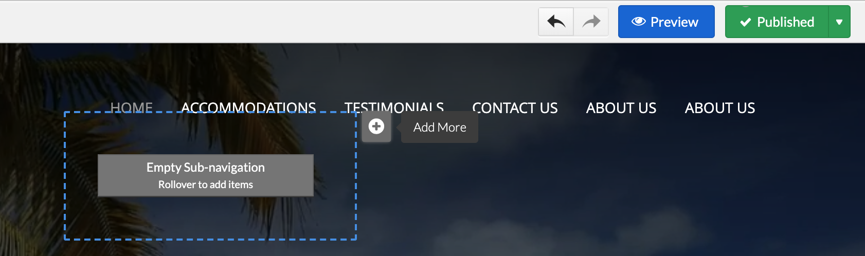
Start adding sub-menu (sub-navigation) items by rolling it over main navigation item, then rollover sub-menu item and clicking the plus icon.
*Sub menu is hidden for designs with main navigation positioned left.
Per page Navigation Area (Secondary navigation)
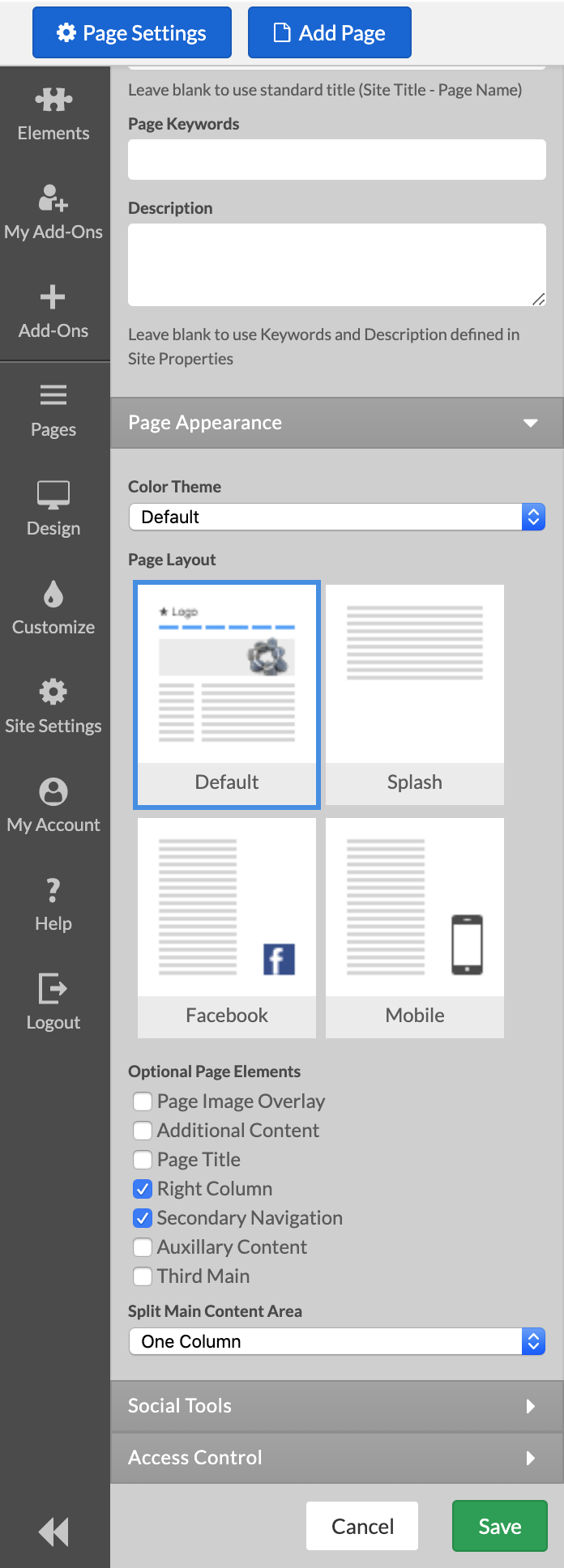
Per page navigation is available with some designs only. The Left/Right Navigation Column must be enabled from Page Settings, Page Appearance to use the per page navigation.
This navigation type allows to display different navigations on different pages from the site. Per page navigation might be appropriate, for example, when the website has multiple product pages and you need a quick reference to all other products from each product page.
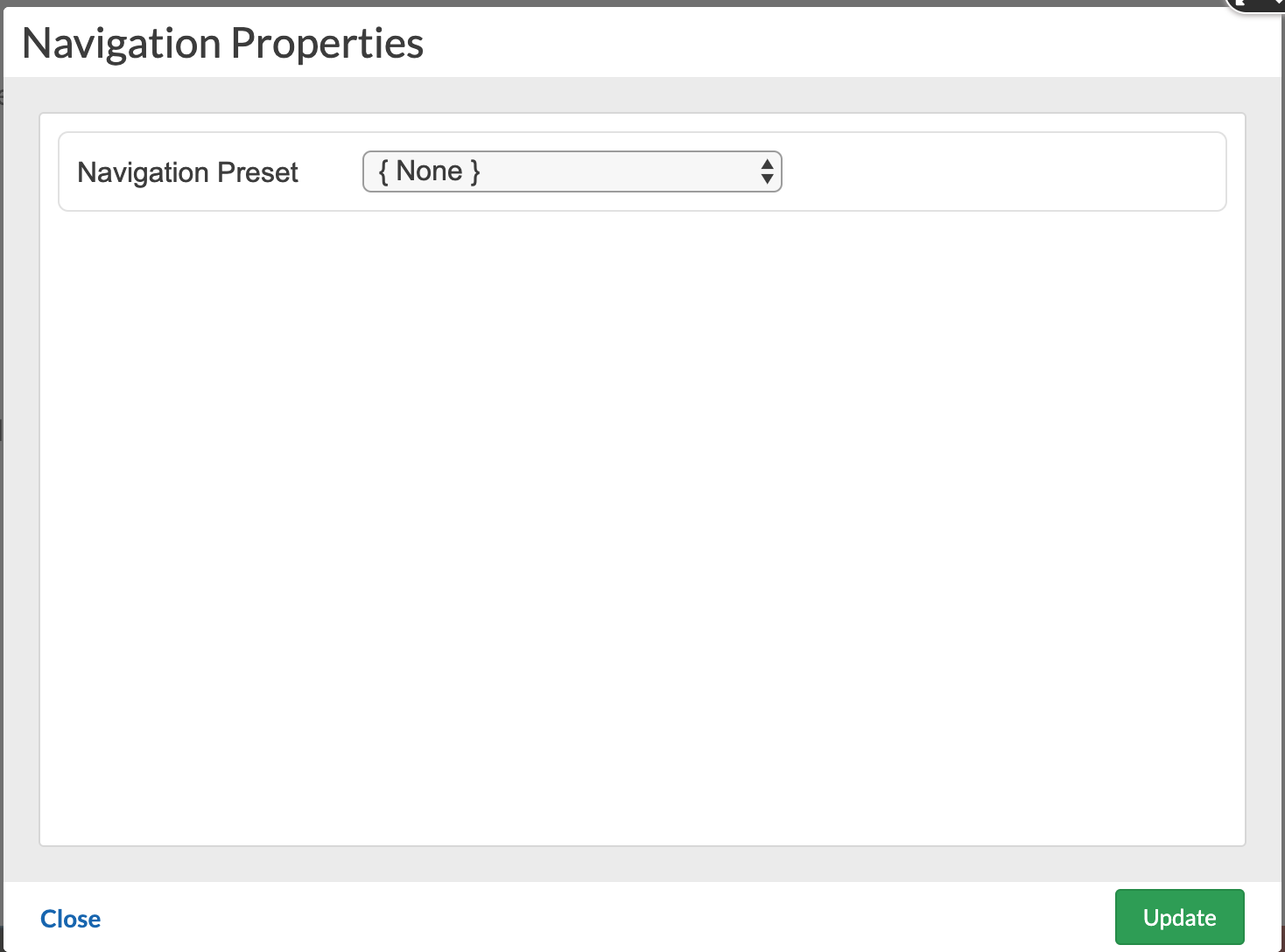
To add a per page navigation rollover the per page empty navigation area and click the cogwheel icon on its top left.
From the Navigation Properties window select [New Preset] and type a name for the navigation. Click Update.
After you add the per page navigation you may start adding navigation items to it by rolling it over and clicking the plus icon displayed on top right.
To display an already added per-navigation area on another page, go to the per page navigation area of that page and click the cogwheel icon.
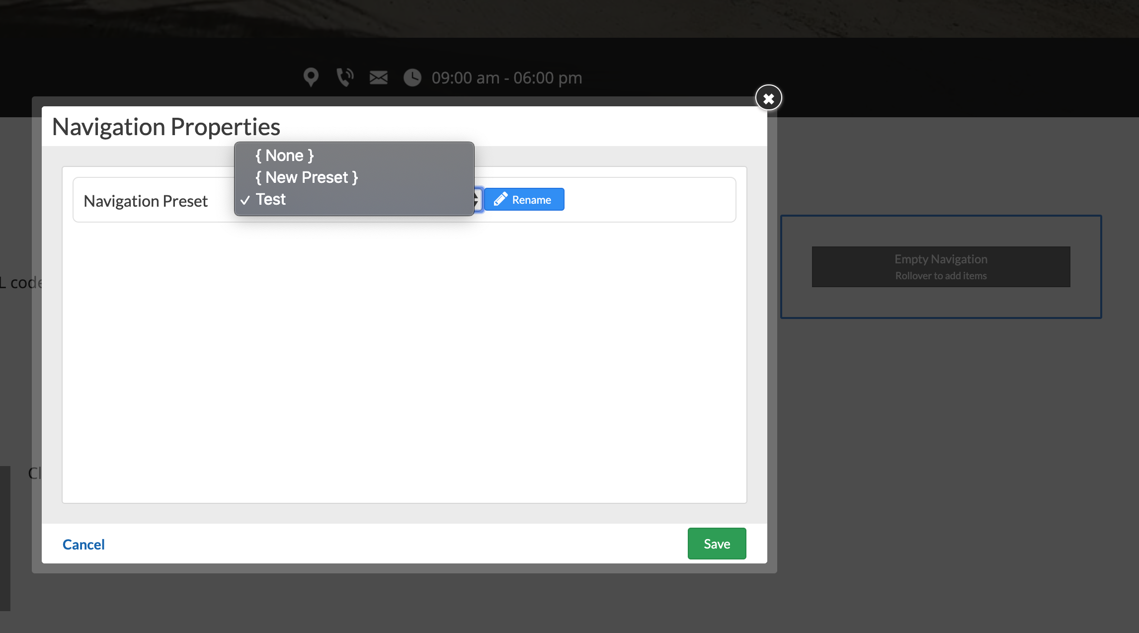
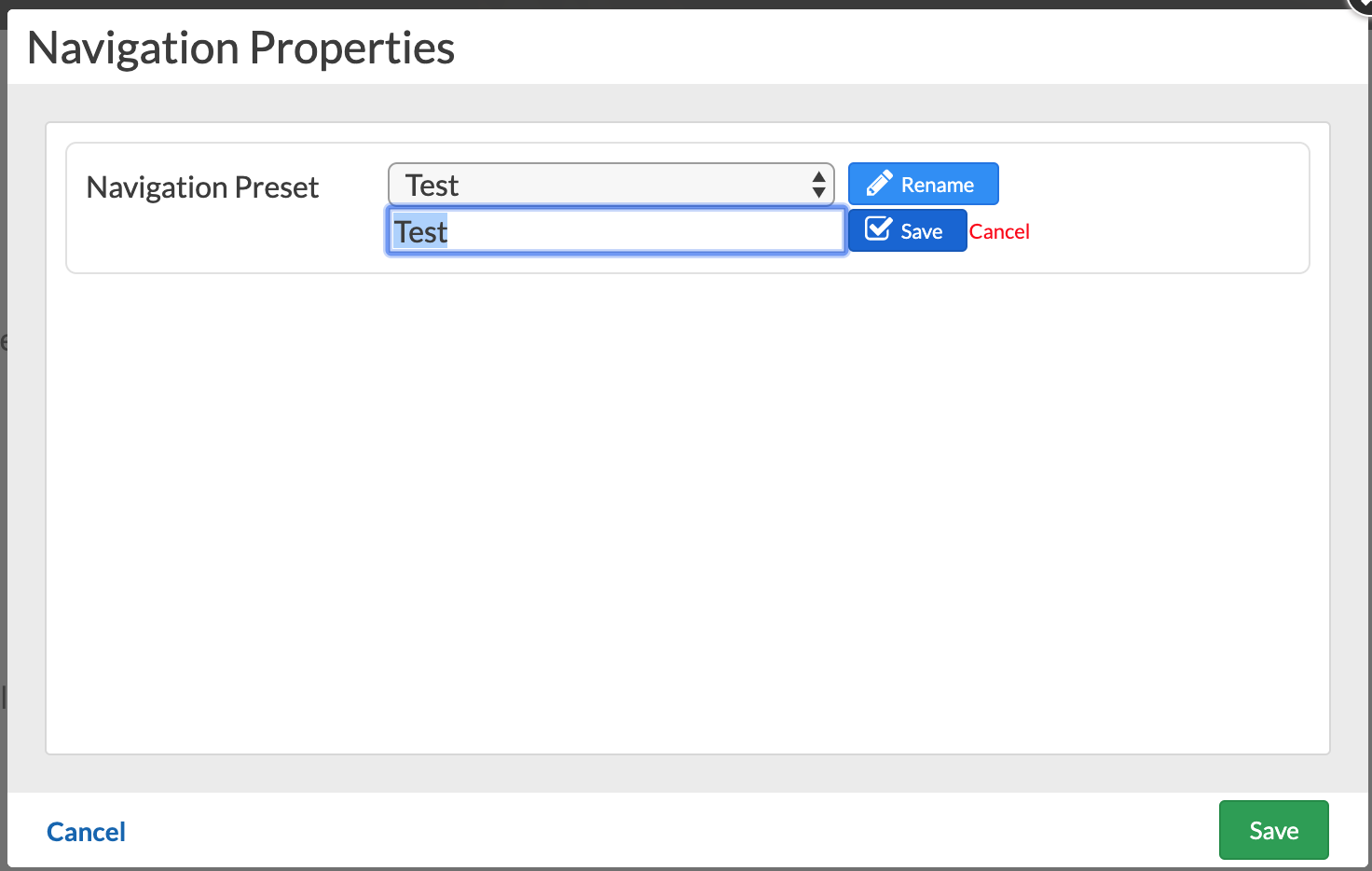
To rename an already added per page navigation select it from the dropdown and click Rename.
Header/Footer navigation
Footer navigation is available for all templates. Header navigation is available for some templates. To add items rollover and click the + icon.
Navigation items
To add any type of navigation items(header,footer,main,secondary):
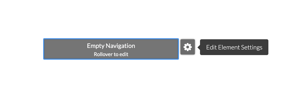
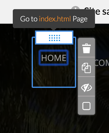
Roll over the navigation area (if it is empty - rollover the gray Empty Navigation box)
Click the plus icon displayed on its top right.

Navigation Item Properties panel will be displayed to the right.
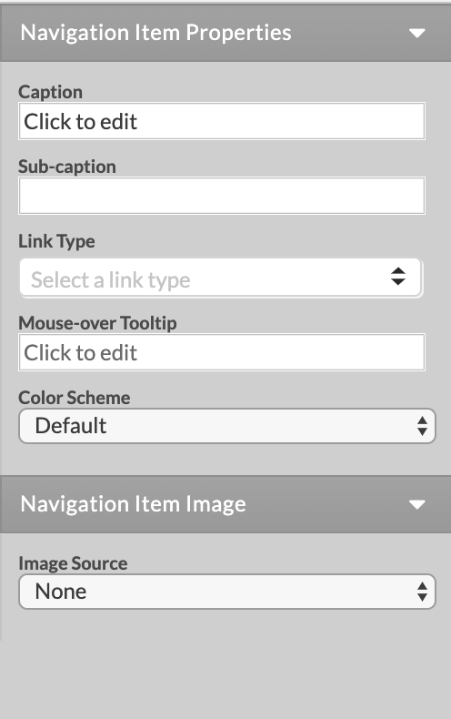
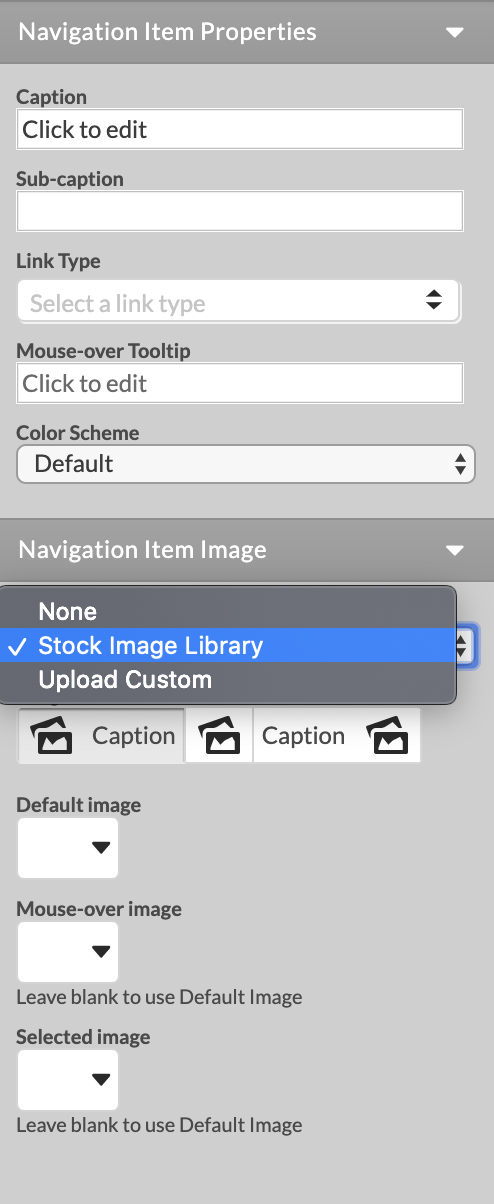
Navigation items have the following properties:
Caption: the text to be printed on the menu item. Captions can be edited inline(on the page).
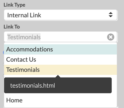
Link Type: {No Link}, {New Page}, Internal Link, External Page, Email.
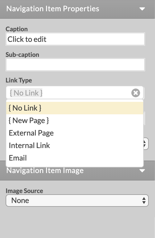
Link To: new page, internal(existing) page, external URL this menu item will link to.
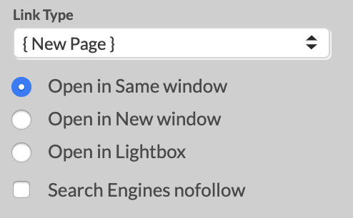
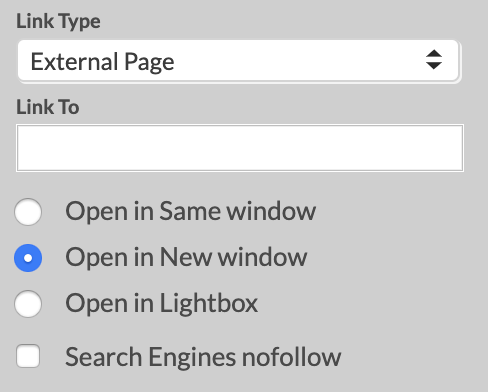
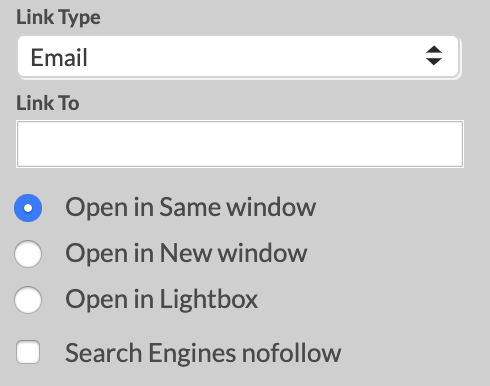
Specify whether your links will open in: Same Window, New Window, Lightbox(pop up window). By default all internal links will open in the same window and all external links will open in a new window
Mouse over tooltip
Color Scheme
Navigation item image: None, Stock Image, Custom Image