
The Collapsible Panel allows you to create an animated expand / collapse panel in any of your custom designs. It is ideal for site maps, support and contact information panels and basically any information you would like to have easily accessible in a prime visual location, but without taking up any space unless invoked.
Creating a Collapsible Panel with Design Pro involves several steps which we will review below.
Layout Editor
Inside the Layout Editor, we have to create 2 containers with special system IDs and add the Collapsible Panel Content and Button.
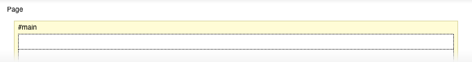
If we want to create a panel that sits at the top of our design we will need an empty layout cell at the top.
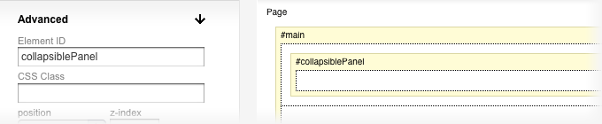
Outer container - #collapsiblePanel
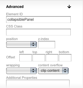
Inside the empty cell, we have to add a container. This outer container will be the one that is expanded and collapsed. It should have a system ID collapsiblePanel - so while the container is selected in the properties panel at left, open the Advanced properties and in the Element ID field enter collapsiblePanel. The ID will be reflected in the container header as #collapsiblePanel.
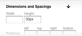
For this container we should also set a fixed height, which will be its default height on page load - it can be any number you want. Setting the height to 0px will make the panel completely hidden by default (note that in this case however you shouldn't put the Collapsible Panel Button inside this container - more on this later).Also for the #collapsiblePanel container, in the Advanced properties at left, we need to set the content overflow option to clip content. This means that any content that goes outside the default height we set will not be visible on the page.
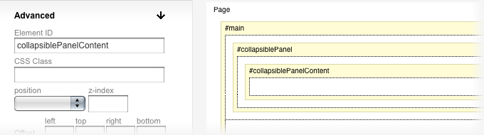
Inner container - #collapsiblePanelContent
Inside the #collapsiblePanel container, we have to add our second container - #collapsiblePanelContent. This second container is used by the program to calculate the height it needs to expand the outer container to, to fit all content. Select the container and in the properties panel at left enter an Element ID collapsiblePanelContent.
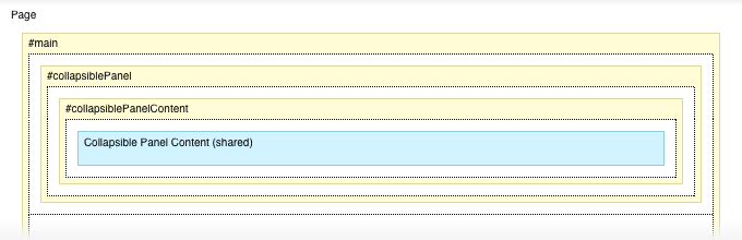
Collapsible Panel Content (shared)
Inside the #collapsiblePanelContent container, we have to add the Collapsible Panel Content (shared) element. This is a standard shared content area and this is where you or your users will add their content. You can use any content area here, but this one is created specifically for this purpose and it will convert properly between designs that support a Collapsible Panel. We can set some paddings for the content area, so that content is not glued to the edges of the panel, and this will also make the expand / collapse animate even when we don't have any content.
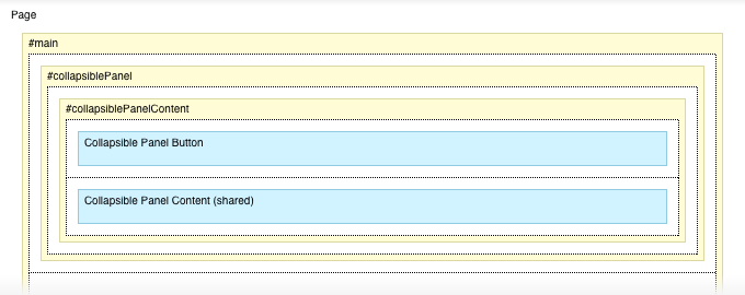
Collapsible Panel Button
The Collapsible Panel Button controls the opening and closing of the panel. Depending on your design you may want to have it inside the panel - like in the Chara example linked at the top of the page - or outside the panel - if you want the panel to be completely hidden by default on page load (height of 0 pixels). In the layout in the image above, the button is inside the panel above the content area.
Styling the layout
As with any other layout element, we can apply styles to these elements, so we can add a background color or texture to the collapsible panel, define widths, set paddings and margins and so on. The graphics for the expand / collapse button are styled through the Style Editor which is our next step below.
Style Editor
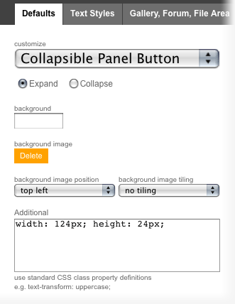
Inside the Style Editor we need to set the appearance for the 2 states of the Collapsible Panel Button - expand and collapse. In the Defaults tab, from the customize dropdown we need to select Collapsible Panel Button and then for both states - expand and collapse (accessible via radio buttons below the drop-down) we have to set a background image and dimensions for the button. To set the width and height of the button, use the Additional box, like in the preview below.