
In this tutorial we will see how, using the simplest possible layout configuration, you can create horizontally expandable designs, even when you use background images to create advanced effects like bevels, rounded corners and shadows.
If you don't use images, but only background colors for your containers, your designs will be naturally flexible - if you add a very large image for instance, the container and its background color will extend to cover the wider content.
Non-flexible designs
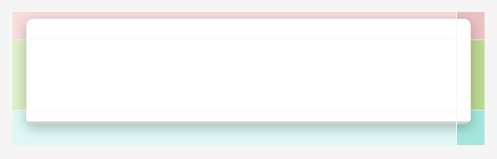
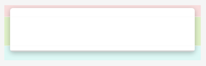
In designs where you have effects such as rounded corners and shadows at the sides of your design, like in the Creating a Simple Site Design tutorial, you are probably using a few containers with backgrounds images
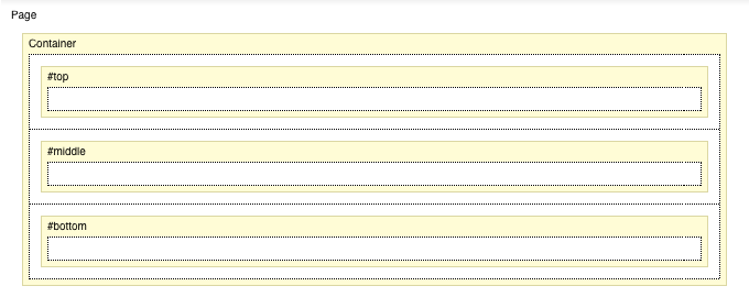
one container at the top with a background image for the top-rounded-corners and shadow (see Fig. 1 and 2 below)
one for the content with a vertically-tiling pattern background image to create the side shadows
and one at the bottom, for the bottom-rounded-corners and shadow
Fig. 1 Layout Editor - layout configuration of non-flexible designs
Fig.2 Top / Middle / Bottom background images
Making the Design Flexible
To make the design body flexible, with the effect-edges expanding to accommodate wider content accordingly, we will need to split each of these containers with the corresponding background-images into two parts:
one part containing the left edge or corner, and its horizontally tiling part extended to be very wide to cover very wide content (see Fig. 3 below)
and another part containing the right edge or corner, and having just enough width to ensure seamless connection with the left image (see Fig. 4 below)
Once we have our split and extended images, we are ready to adjust the layout structure. With the usual approach for non-flexible designs (above) for effects, we have one container with the image containing the effects set as a background.
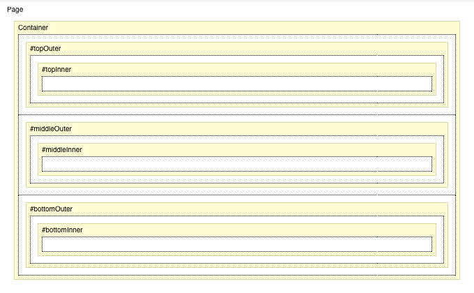
For flexible designs we will need to have 2 nested containers for each row of the layout. So that's 2 nested containers for the top part, 2 nested containers for the middle (content) part and 2 nested containers for the bottom part (see Fig. 5 below). For the outer container we have to set the right image as background, and define a right padding equal to the width of the image (so if the image is 50 pixels, the right padding should be 50 pixels as well). Then for the inside container we have to set the left image as a background. The same setup should be done for all 3 rows (top, middle, bottom).
The rest of the layout configuration is the same as seen in the Creating a Simple Site Design tutorial
+ fixed height for the top and bottom containers, to make sure they appear as you probably won't have content inside them
+ vertical tiling set for the background images in the middle (content) section
+ content elements such as Main Content Area added inside the inner (nested) container
Fig. 3 Very wide image for top-left corner and top edge. Cropped to just 680 pixels below. Click image for full size.
Fig. 4 Image for top right-corner.
Fig.5 Layout Editor - layout configuration of flexible designs
Fig. 6 Top-left / Top-right / Middle-left / Middle-right / Bottom-left / Bottom-right background images