
Call To Action Buttons
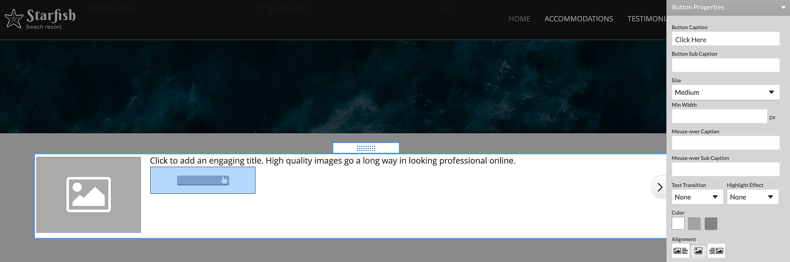
Call to Action (CTA) buttons are available as part of the Text and Image and Form elements. The CTA buttons allow you to add customizable buttons for submitting a form, downloading a file or forwarding a visitor to a specific page. Each button features settings for color, size, captions, sub-captions and icon image.
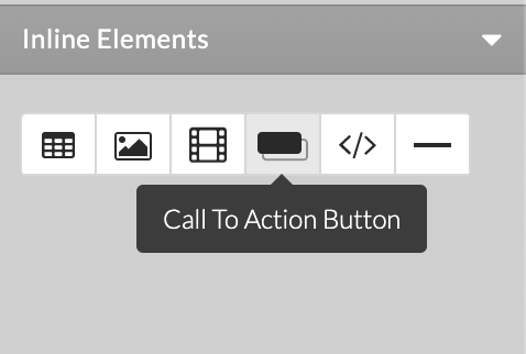
CTA buttons can be inserted inside a Form or Text and Image element using the button icon available in the toolbar on the right of the editor .
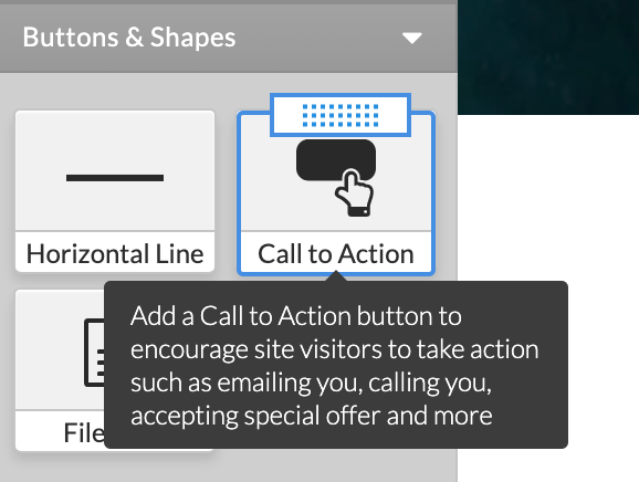
There is an option to add a CTA button from Left menu > Elements > Buttons and Shapes. Drag-and-drop the element to a blue placeholder on the page.
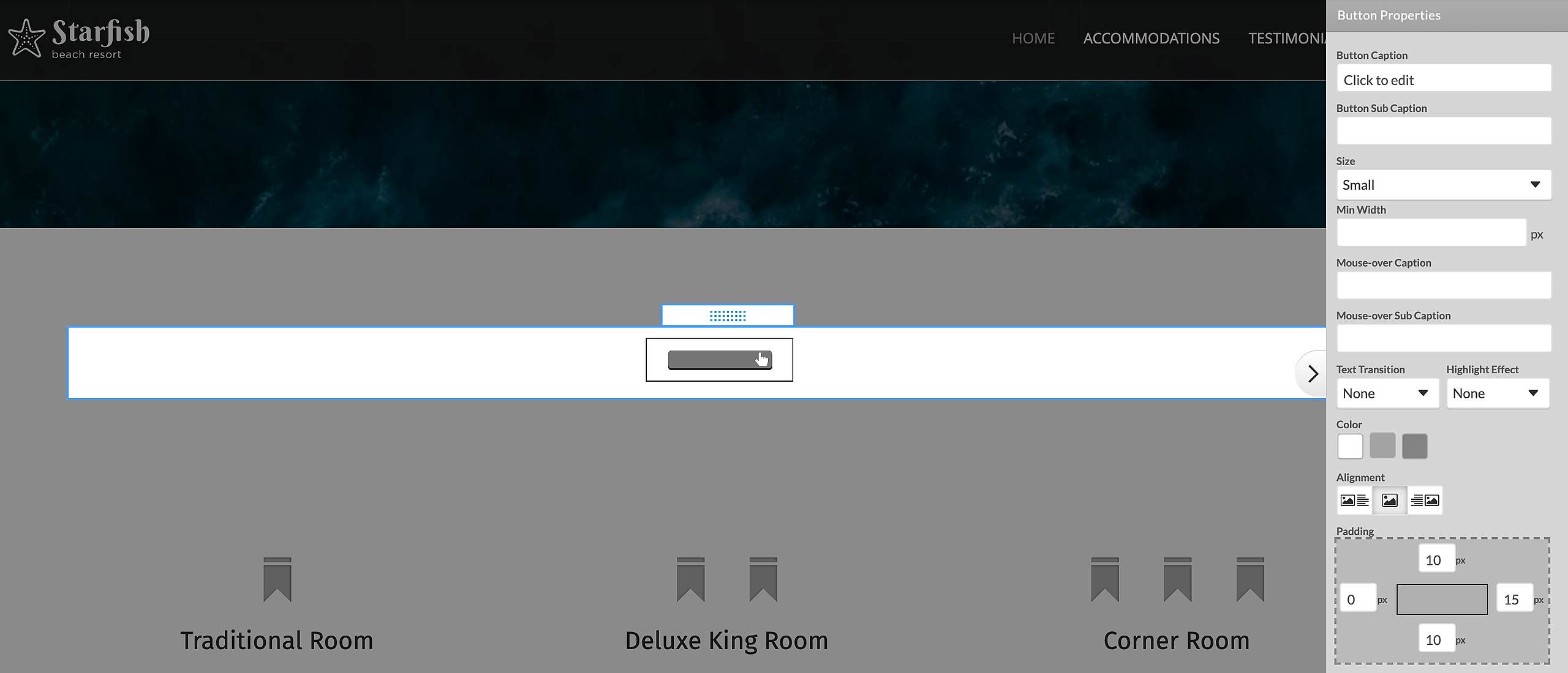

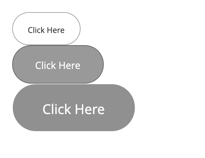
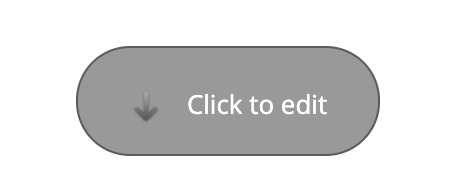
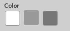
Depending on the design, the CTA buttons are available in different shapes, sizes and colors.
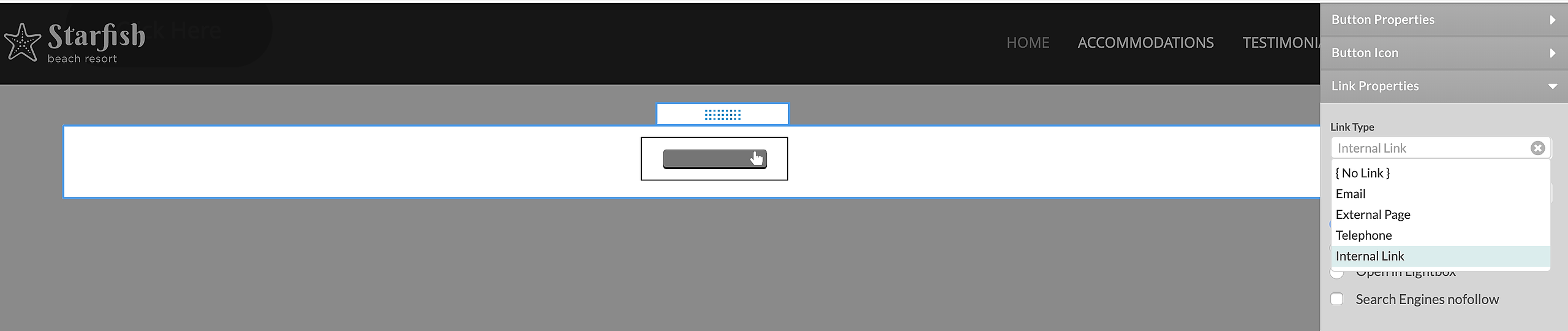
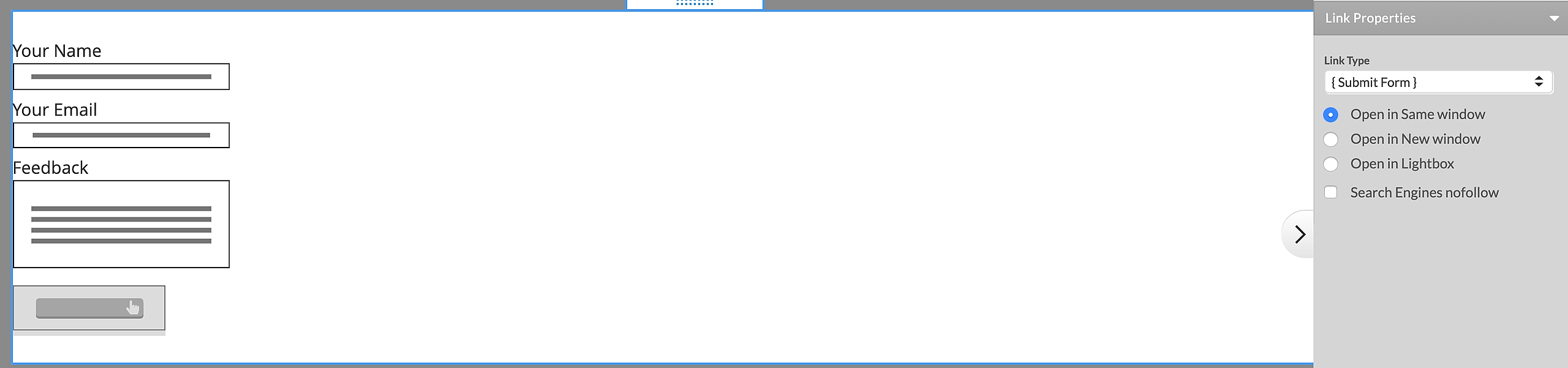
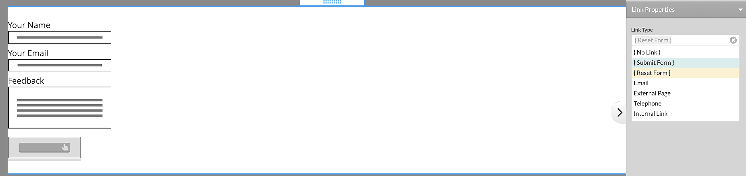
In order to add a link to the CTA button, choose the desired page from the Link Type drop-down menu, or set a "Submit" or "Reset" action if it is added in a Form.
Standard Options
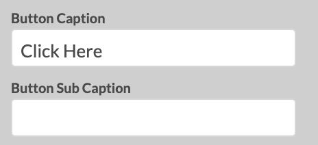
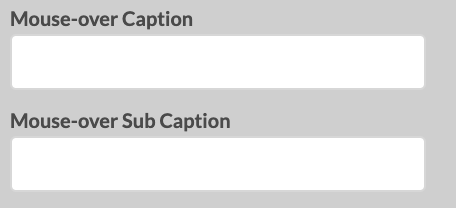
Use the editable fields in the right panel to change the Captions text and Mouseover Captions text the button will display.
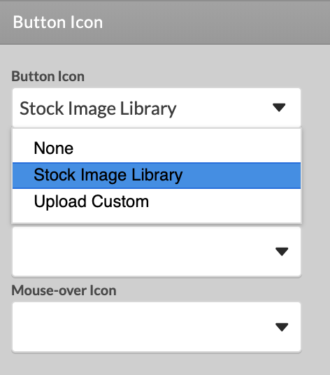
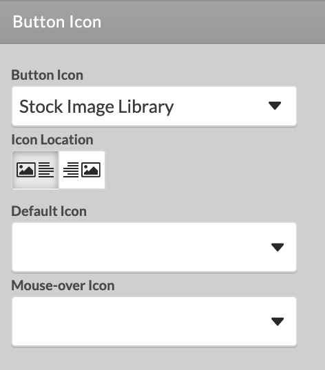
Button Icon Source drop-down menu. You can select to Upload a Custom image that will be placed inside the button, or choose such from our Stock Image Library. The Stock image library features two sets of images, Pictograms and Icons, that can be added to the given button.
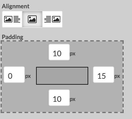
You can set different button alignment and padding.
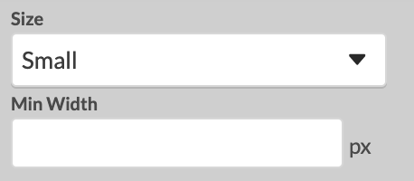
Select from three predefined button sizes - Small, Medium or Large, and a desired color theme suitable for your design theme.
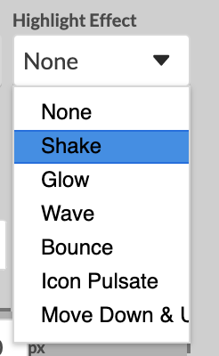
Set a Highlight Animation Effect. When such effect is applied to the button, it will appear 3 seconds after the page is loaded and it will be repeated on every 30 seconds.
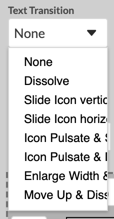
You can select from a list of Text Transitions to be used between the Captions text and the Mouse-over Captions text transition.